20 Brands Tried To Redesign Something But It Wasn't Worth The Effort
Well, some people aren't happy about these redesigns!
Independently testedUnbiased Demilked scoreFree to implementTools included
Sometimes, people's sentiments get attached to brand logos and certain animated characters. So, when the designer decides to redesign them, the change is not appreciated by many folks. Truth be told, the designers do mess things up badly sometimes.
Whether it's a Burger King logo or the redesigned characters of Scooby Doo, the Reddit group "Crappy Redesign" is the place where people go online to vent out their disappointment about unfortunate changes to their favorite logos and characters. Check out some of their posts in the gallery below.
More info: Reddit
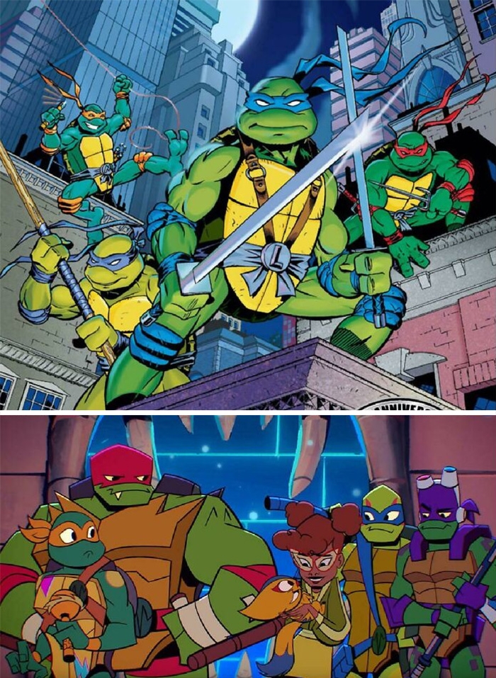 Image source: neogeo5185
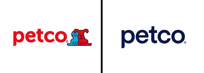 Image source: EthanIceWaffle
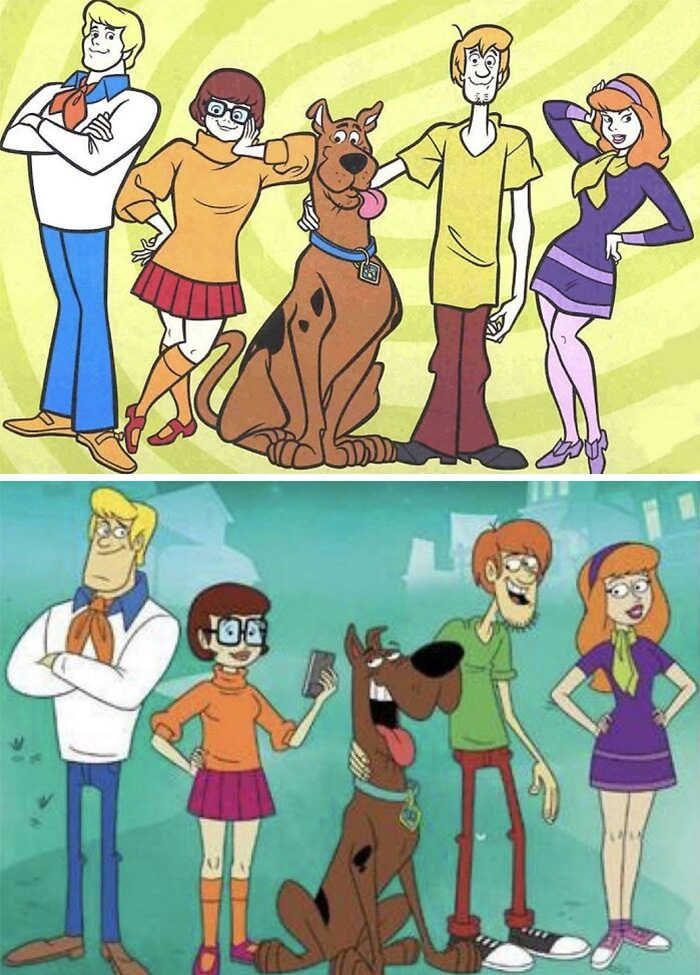 Image source: Red_Leader_2020
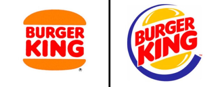 Image source: imgur.com
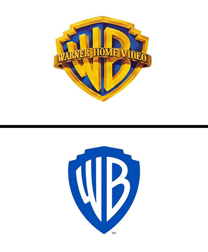 Image source: Stephanoi_Gamer
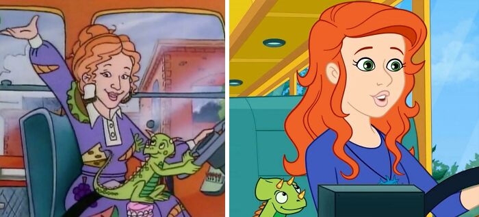 Image source: TheExekutive
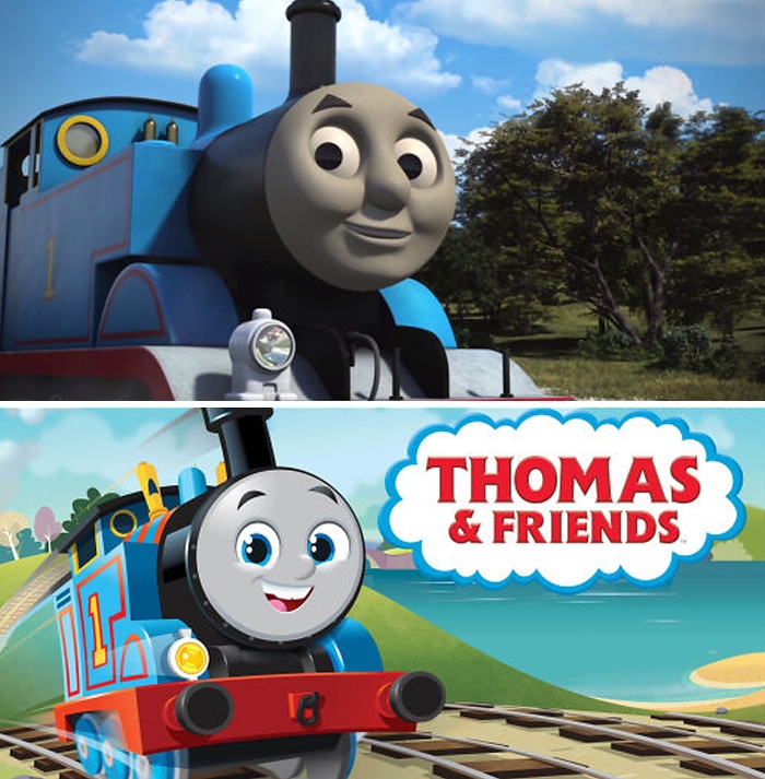 Image source: The_BackOfMyMind
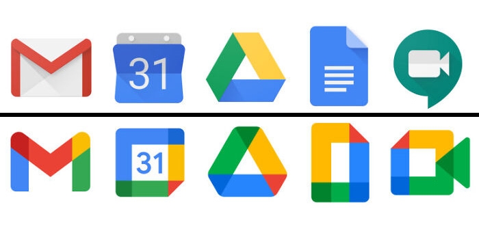 Image source: Ovitsbole
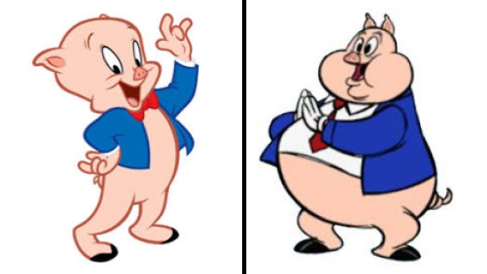 Image source: _himo88
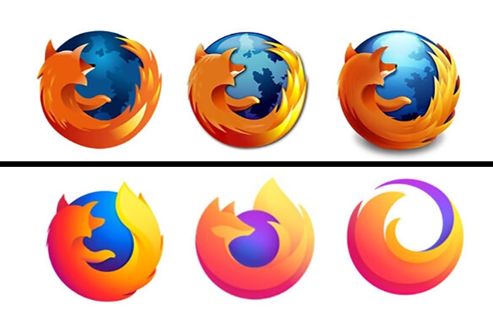 Image source: Stephanoi_Gamer
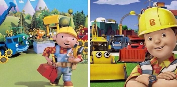 Image source: aPingapongball
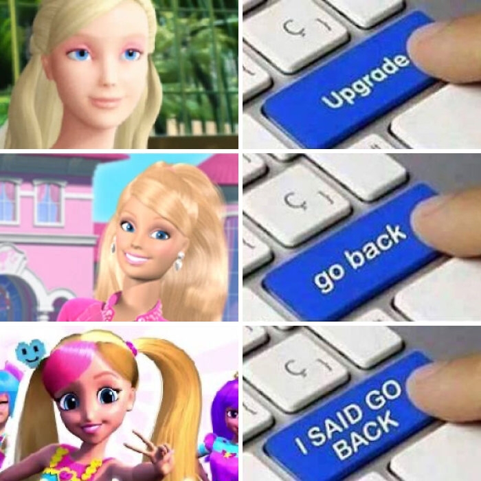 Image source: reddit.com
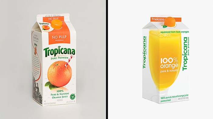 Image source: AndyH16
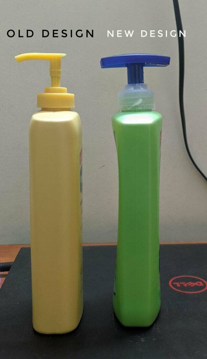 Image source: reddit.com
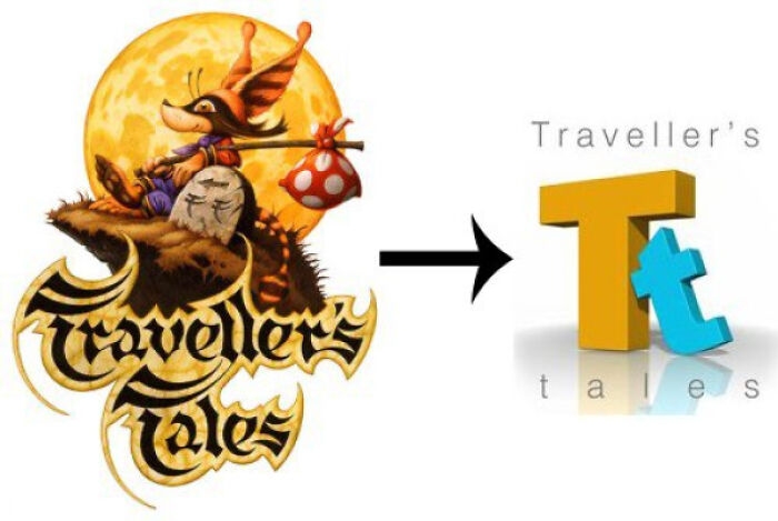 Image source: ItsDaDoc
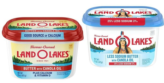 Image source: diphthing
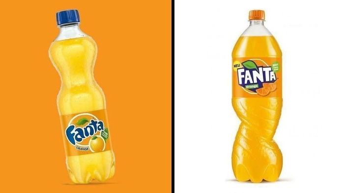 Image source: random___pictures1
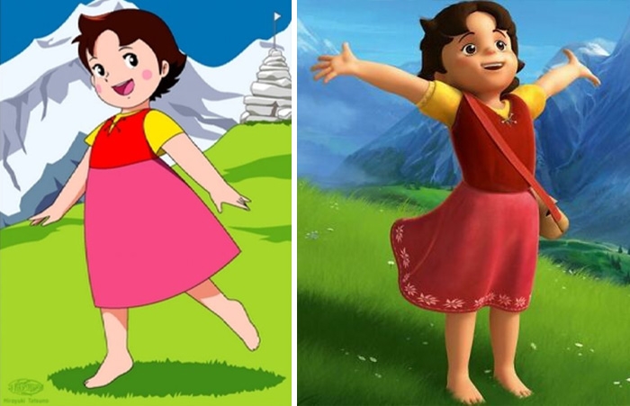 Image source: MiJokri
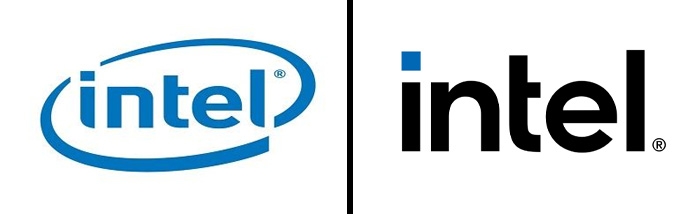 Image source: TheGreenGobblr
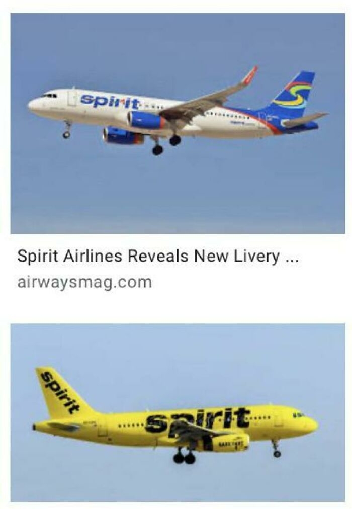 Image source: JLirl
#1 Heroes In The Half-Shell To Whatever This Is
Image source: neogeo5185
#2 Well This Is Lame
Image source: EthanIceWaffle
#3 Ruh-Roh!
Image source: Red_Leader_2020
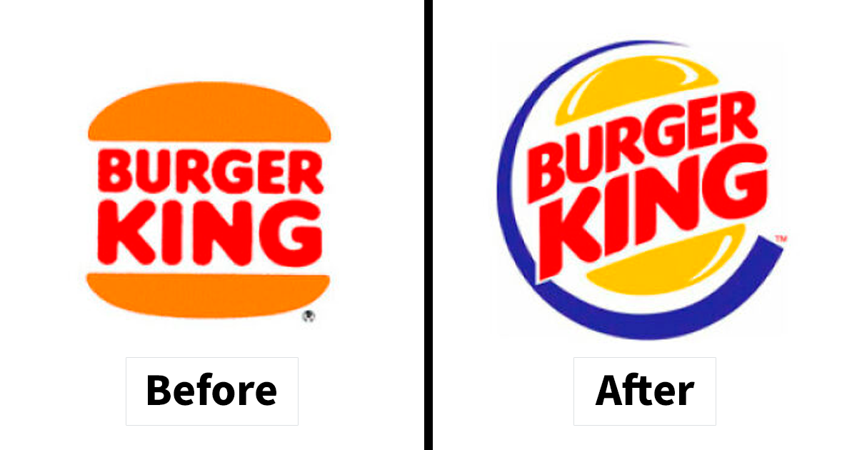
#4 Burger King Was Another Victim Of The 90s Redesigns
Image source: imgur.com
#5 So Will The Films Get More Simplified?
Image source: Stephanoi_Gamer
#6 What Did They Do To Ms.frizzle?
Image source: TheExekutive
#7 Thousands Of Cgi Assets Wasted In One Fell Swoop
Image source: The_BackOfMyMind
#8 What The Actual Fawk??
Image source: Ovitsbole
#9 Just Why ? (Porky Pig)
Image source: _himo88
#10 What Will Be Next ? It'll Finish The Circle ? Nothing Is Going Right With The New Logo
Image source: Stephanoi_Gamer
#11 Virgin Cgi Bob vs. Chad Clay-Mation Bob
Image source: aPingapongball
#12 Barbie Redesign
Image source: reddit.com
#13 Look How They Massacred My Boy
Image source: AndyH16
#14 Take A Design That You Can Use Correctly Even In The Dark And Replace It With An Abomination That You Can Get Wrong Even In Broad Daylight
Image source: reddit.com
#15 Developer Downgrade
Image source: ItsDaDoc
#16 They Removed The Native American, But Kept The Land. Classic
Image source: diphthing
#17 I Don't Like The New Fanta Redesign
Image source: random___pictures1
#18 From My Favourite Childhood Anime To Another Bland 3D Animated Show
Image source: MiJokri
#19 The New Intel Logo Is So Boring
Image source: TheGreenGobblr
#20 This Is By Far The Worst Redesign I’ve Ever Seen
Image source: JLirlDE
Written by
Demilked Editorial
SaaS Review Specialist · Demilked
With 5+ years in the creator, entertainment, and publishing spaces, Demilked shortlists, reviews, and ranks leading tools that actually make your life easier.