Secret Recipe of Designing Perfect Website
The title says it all. All great meals start with a great recipe and the same goes for building the ingredients to make a great website or landing page. So let’s look into what it takes to bake your first page or website to which you’ll want to make sure your visitors bite.
Technically, a landing page is any page on your website where visitors can arrive (or land) when they clicked a link. The most concerning point now is to get you to do what this page was created for. You also need to make sure the content is worth the click it took for people to visit and that it’s worth their time to make it to the end where you will put a call to action (CTA).
So what are the ingredients you look to get:
1. A deliciously looking unique selling proposition (USP)
2. 1 hero shot or video
3. 4 – 8 mouth-watering benefits
4. Show context of use (case study)
5. An enticing form
6. 1 – 3 trust elements
7. 1 got to have Call to action
8. A spoonful of post-conversion sugar
9. You’re first A/B taste test
1. A deliciously looking unique selling proposition (USP)
Make your important web viewers feel like a kid in a candy store, with a headline that persuades them to continue. Your USP should describe exactly what you are about in a sharp to-the point sentence. It’s usually the first thing people will see on your page and for PPC, it should match exactly (or very closely) the CTA and/or title of the upstream ad.
If you find yourself with a headline that’s too long then consider adding a smaller subheader, which can explain your purpose in more detail, while keeping the headline short and sweet.
Example
Bad
Check email every 5 minutes? Stop! Let us find your urgent messages.
Better
(38% increase in conversions)
Checking email every 5 minutes? Stop!
Get away from your inbox – let urgent emails cut through the clutter and FIND you…instantly.
Note – how the second version maintained the same main message in a much shorter fasion, letting supporting copy remove some of the burdon.
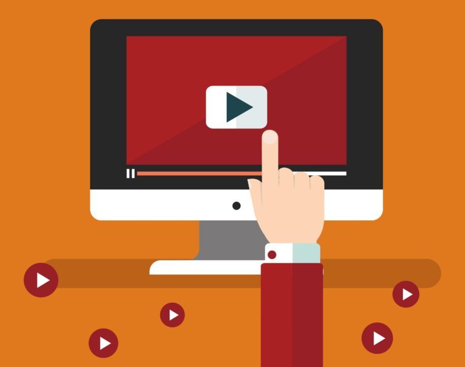
2. Hero shot or video
We’ve all heard the phrase ‘A picture is worth a thousand words’ well to have an effective landing page; you need to add a few tablespoons of powerful imagery or video that’s shows off your product or service.
Do: Create an original photo or video demo
Do: Show it being used to show context of use
Do: Consider getting a professional service to produce a video for you to increase conversions
Don’t: Use stock imagery as you’ll diminish the trust in your page and look cheesy.
3. 4 – 8 mouth-watering benefits
The style with which you write about your product or service should in the form of how it will benefit them and their business, not simply a list of features. Style wise, they should be in the form of bullet points so they are easy to read. (Like a step by step recipe for cookies). Consider the difference between these two statements.
Bad (feature based)
Our powerful new battery
Better (benefit based)
Our new battery means you’ll only need to charge your phone every couple of days
The second resonates with a target users’ needs by tackling a real pain point. Remember to limit the number of benefits to only the very best highlights of your product or service so as not to overwhelm people.
4. Show context of use
The concept here is to show your product or service actually being used. To stick with the recipe idea, consider trying to decipher the snstructions in a cookbook, compared to watching someone do it step-by-step on a video.
Remember the slap chop? A totally useless kitchen tool (if you ever tried using one). But the way its presented in the video uses context of use brilliantly to illustrate the benefits of owning one – take a look – https://www.youtube.com/watch?v=rUbWjIKxrrs
5. An enticing form
Zero forms? What does that mean? Well, your landing page might be eaten for different reasons. If your selling cupcakes or food deliveries, then this is a form of ecommerce, in which case you might use a click-through page. The goal here is to turn that oven up to 350 degrees to warm up the visitor to the idea of buying your treats and then send them off to your shopping cart page.
If, however, you’re doing lead capture, then you will need a form and you want to make it as clear as possible. You can do this by using encapsulation (surround it with a coloured box) and contrast to isolate it visually from the rest of the page. If you really want people to find your form tasty, then you’ll need to give them something special in return (like a sweet eBook or an invite to a webinar).
6. 1-3 Trust elements
People need to believe you in order to buy your product or service. To do this you add trust elements to your page. Examples are client testimonials, social widgets, press appearance logos, customer logos or a stream of positive tweets about you.
Imagine walking by a restaurant that had only one couple eating in it, and next door there was a que outside. Which one would you choose? It’s the same with landing pages, the more you can convince people that you are worth sticking around for, the more conversion you’ll get.
Test adding testimonials with and without names and photos, a line of impressive placements you’ve had in the press (if any). In other words, just try to make your page appear as popular and trustworthy as possible.
If you are doing a webinar, sho the registration count to attrack peoples herd mentality and FOMO (fear of missing out).
7. Call to action
Think of your CTA like the candle on the birthday cake of a 70 year old. At this age its ridicoulous to ad 70 candles, the standard rule is to use one only.
This is how your landing page should be.
There should be only on thing to do, blow out that one candle – or in marketing terms, click the single button on the page. Having multiple calls to actions will exhaust the visitor with options just as it would to blow out all those candles in one breath.
8. A spoonful of post-conversions sugar
In ingredients #3, I entioned social widgets. You can add them to your page if they show a high count as it tells people you are popular – however, this runs the risk of adding too much clutter to your page – like those 70 candles on the cake from ingredient #7.
To mitigate this, use your confirmation pages (the page that shows after your visitor downloads your eBook, or the page after a purchase in an ecommerce flow).
On this page you really want to be taking advantage of your happy customer and getting them to do something else, such as signing up for your newsletter, or buying something else at a discount.
9. Your first A/B taste test
So you’ve made your first landing page and its time to try the classic Pepsi taste test, where you pit one page against a variation of that page. But where do you start? Often it’s a good idea to try the main headline.
Example
We ran an example test on a headline, based on traffic from a CTA on our blog. One was based on a personalised message, the other on asking a question. Check out the results.
A – Hi blog reader
B – Wanna run better marketing campaigns?
Version A converted at 24% while version B converted at 12%. Quite a difference, which shows the value of A/B testing.
Richard Kearsey is a creative director one of the best web design agency in Berkshire, New Media, specialises in providing website design, logo design, UI design and digital marketing services. He has a passion for WordPress and User interface design, and enjoys working with variety of entrepreneur and small business throughout the UK.


Got wisdom to pour?
As an online coach with clients worldwide, I often struggled with slow international payments. I decided to adopt an Ethereum payment processor to simplify transactions. By connecting with https://0xprocessing.com/supported-coins/accept-payment-ethereum/ , I could accept Ethereum directly. The platform converts crypto into stablecoins automatically, ensuring predictable cash flow despite market volatility. Its intuitive dashboard allows me to track all payments, making accounting hassle-free.
It is very important to then find a suitable way to pump up your site, here you can find more information on how to increase traffic to website https://propellerads.com/blog/increase-website-traffic/ . Email marketing remains one of the most reliable channels for repeat traffic. Building an engaged subscriber list gives you direct access to your audience. Share exclusive content or helpful updates to keep people interested. This can turn casual visitors into loyal readers or customers
I cannot imagine now any successful business without a high-quality, modern web resource. Graphic illustrations are an integral part of an attractive web design that will help you stand out from everyone. The undoubted advantage of vector graphics is that the designer has the ability to work with individual fragments of images, in addition, there are now really cool applications for these purposes, such as Amadine https://amadine.com
Website plays an important role in an online business. Designing a website is also a crucial part of an online business. I am very glad to read the informative blog. Learning web designing course along with digital marketing course in Bangalore it’s more powerful to your online business.
https://www.digitalacademy360.com/digital-marketing-courses-bangalore.php