20 Examples Of Bad Logo Designs Shared By People In This Twitter Thread
What were the graphic designers thinking?
Independently testedUnbiased Demilked scoreFree to implementTools included
Logo designing is one of the most creative and challenging categories in graphic design. If done right, simple arrangements of words and images can effectively communicate a great deal of stuff. However, if not done right, it may look absurd and ridiculous!
Recently, a Twitter user "good small horce" shared a "Women's Network" logo design and said, "I am a graphic designer and this is the worst logo I've ever seen". The tweet received many replies in which people shared some more logo designs that they found terrible. Scroll below to see some of them.
More Info: Twitter
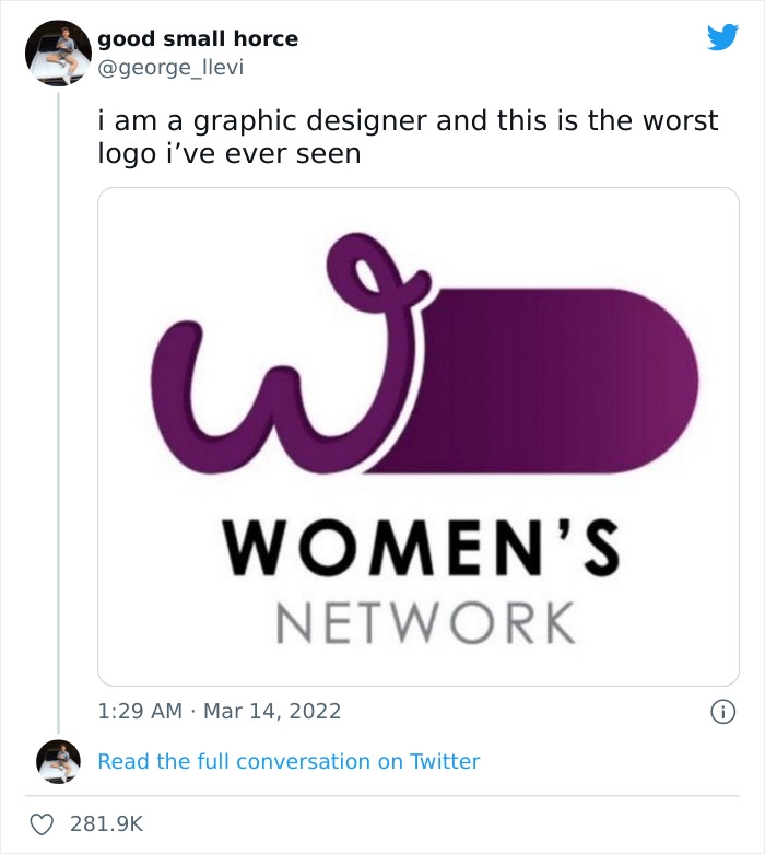 Image source: george_llevi
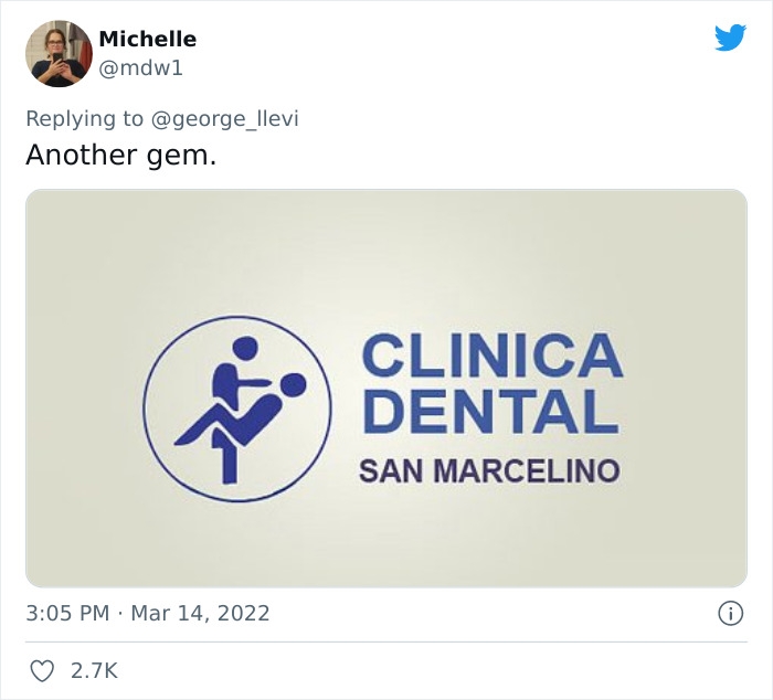 Image source: mdw1
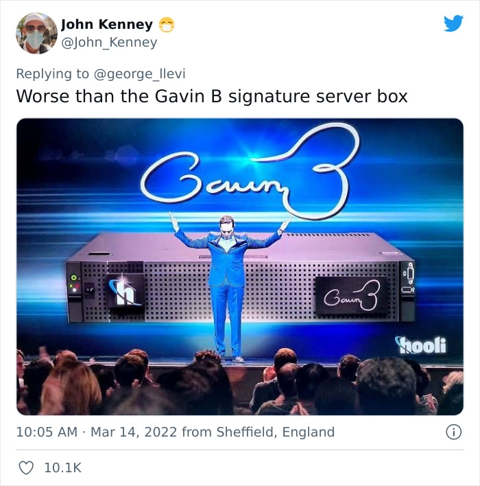 Image source: John_Kenney
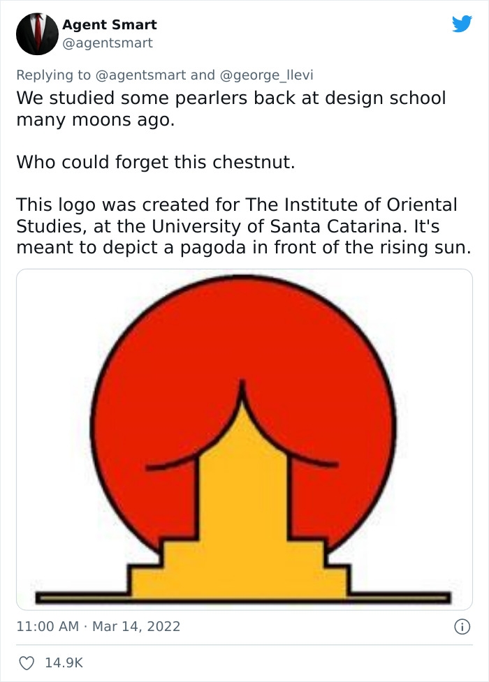 Image source: agentsmart
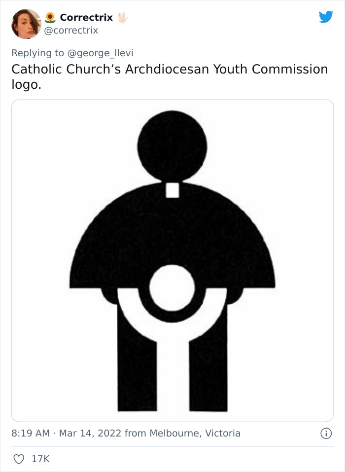 Image source: correctrix
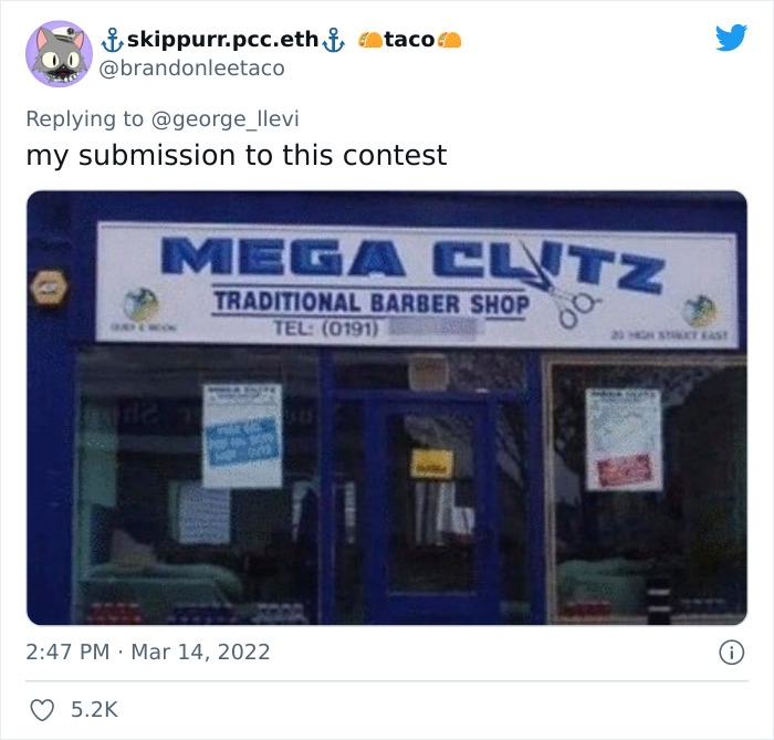 Image source: brandonleetaco
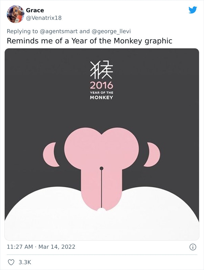 Image source: Venatrix18
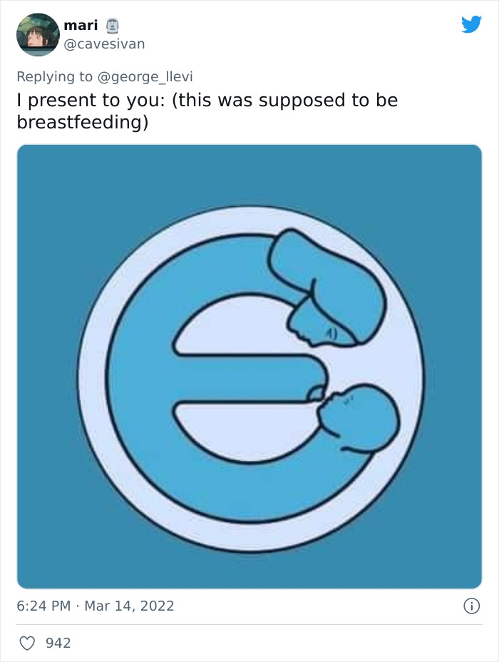 Image source: cavesivan
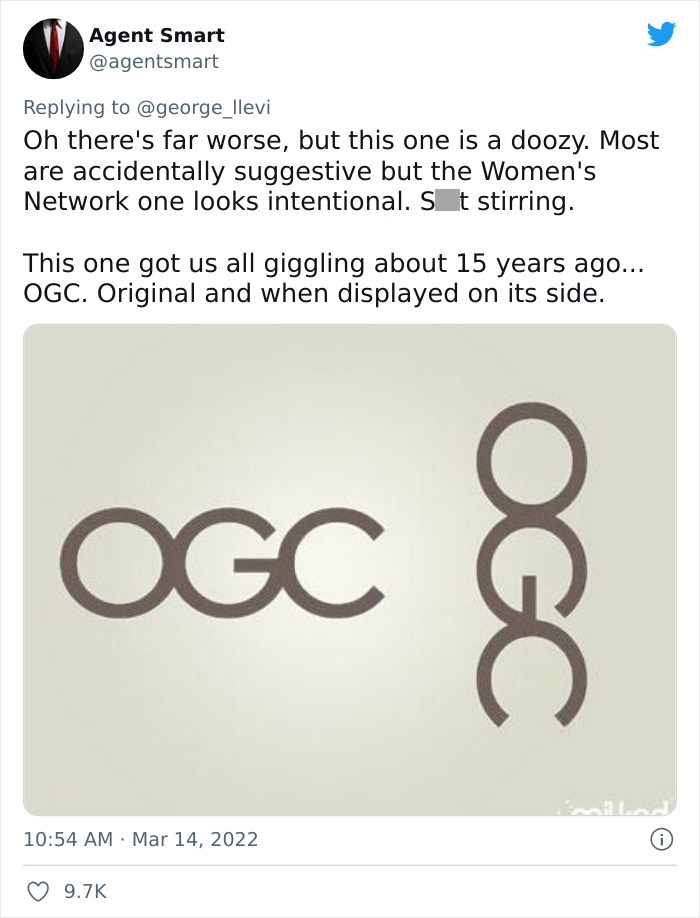 Image source: agentsmart
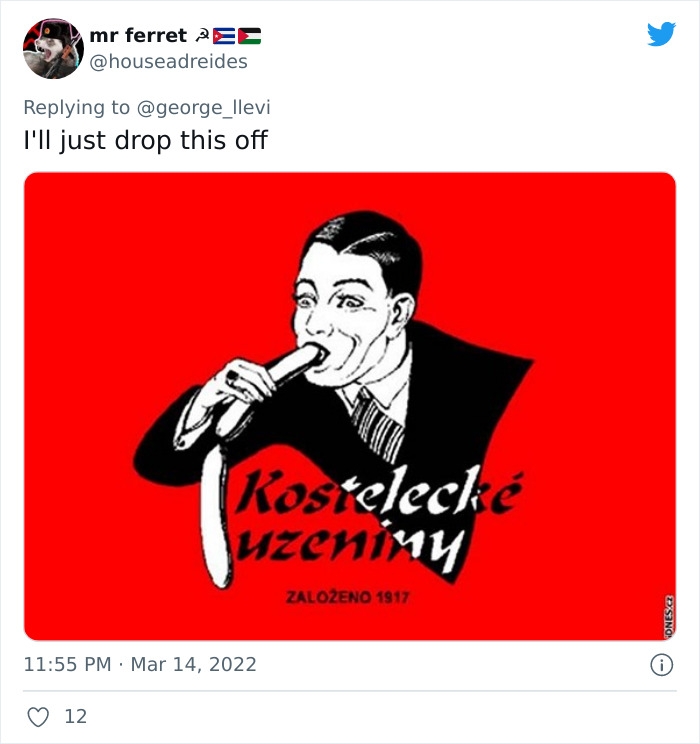 Image source: houseadreides
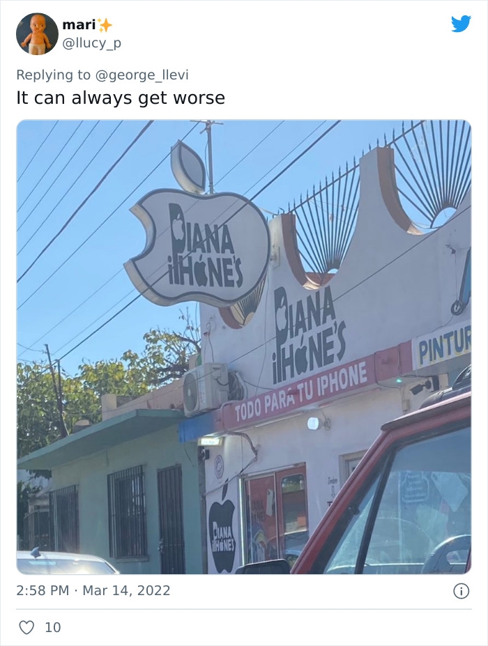 Image source: llucy_p
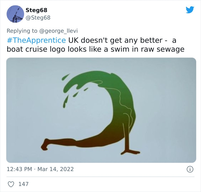 Image source: Steg68
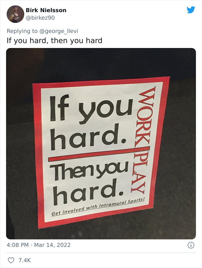 Image source: birkez90
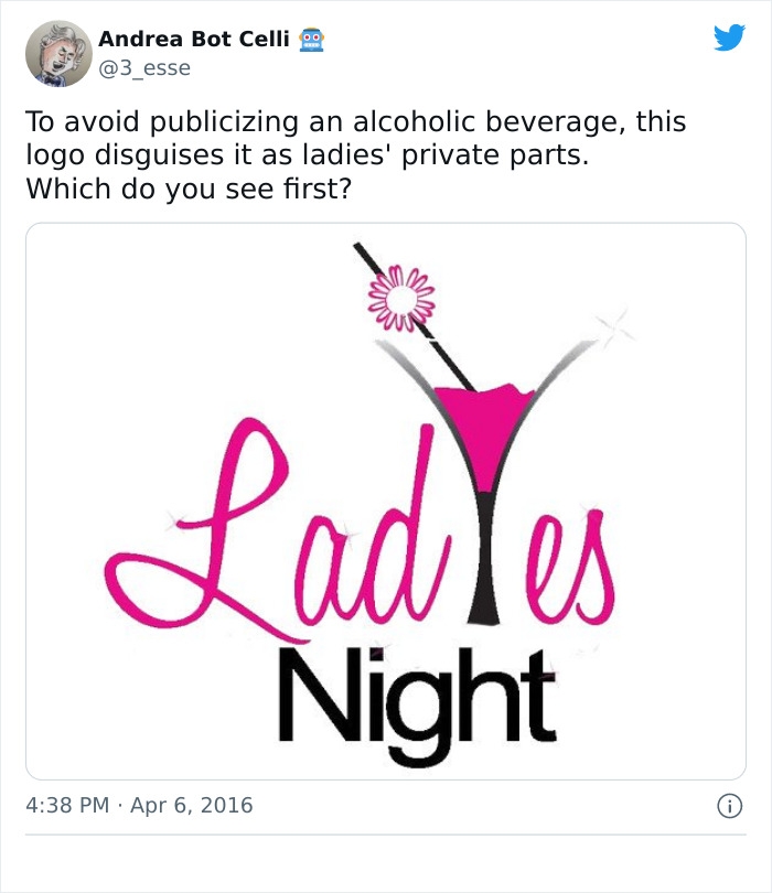 Image source: 3_esse
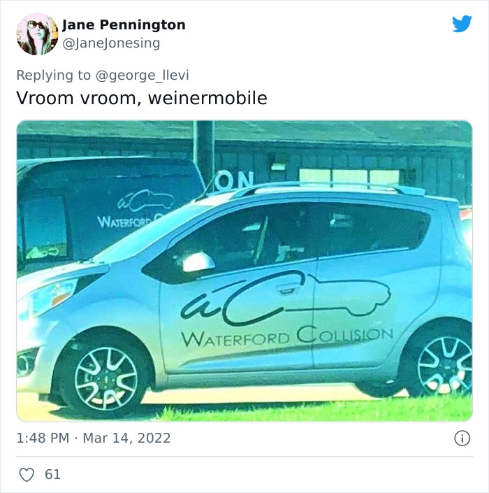 Image source: JaneJonesing
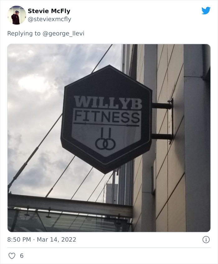 Image source: steviexmcfly
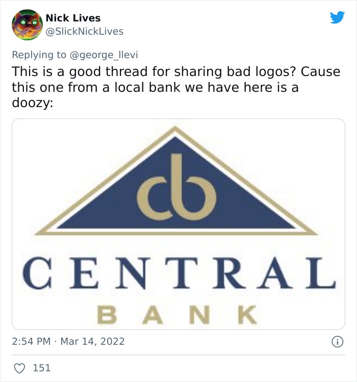 Image source: SlickNickLives
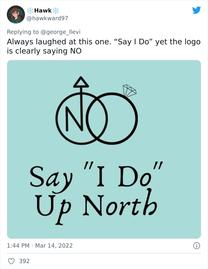 Image source: hawkward97
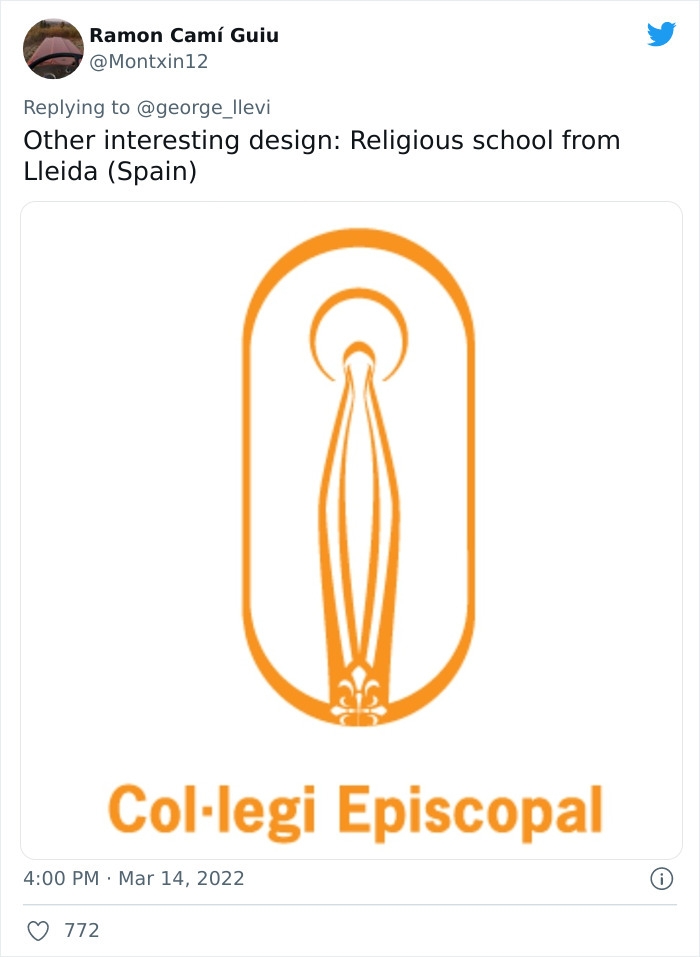 Image source: Montxin12
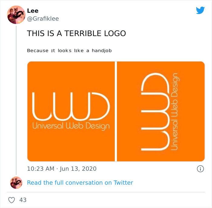 Image source: grafiklee
#1
#2
#3
#4
#5
#6
#7
#8
#9
#10
#11
#12
#13
#14
#15
#16
#17
#18
#19
#20
DE
Written by
Demilked Editorial
SaaS Review Specialist · Demilked
With 5+ years in the creator, entertainment, and publishing spaces, Demilked shortlists, reviews, and ranks leading tools that actually make your life easier.