McDonald's New Ad Turns Their Famous Golden Letters Into Navigation Signs
A new ad campaign has been launched by McDonald's Canada and it uses the famous brand's logo showing not only it's recognizability but also how the simplest idea can turn into a genius ad.
Independently testedUnbiased Demilked scoreFree to implementTools included
A new ad campaign has been launched by McDonald's Canada and it uses the famous companies logo showing not only it's recognizability but also how the simplest idea can turn into a genius ad. In collaboration with marketing communications agency Cossette, McDonald's has deconstructed its iconic golden arches to direct costumers to their nearest fast-food restaurant. This "Follow the Archers" Campaign amazes with its simplicity and a smart use of the graphic elements. Check out these basic yet genius billboards below!
Interested in what else Cassette has to offer? Check their work here. (h/t DesignTaxi)
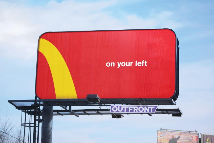 Image source: Cossette
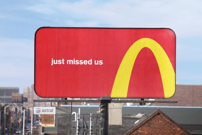 Image source: Cossette
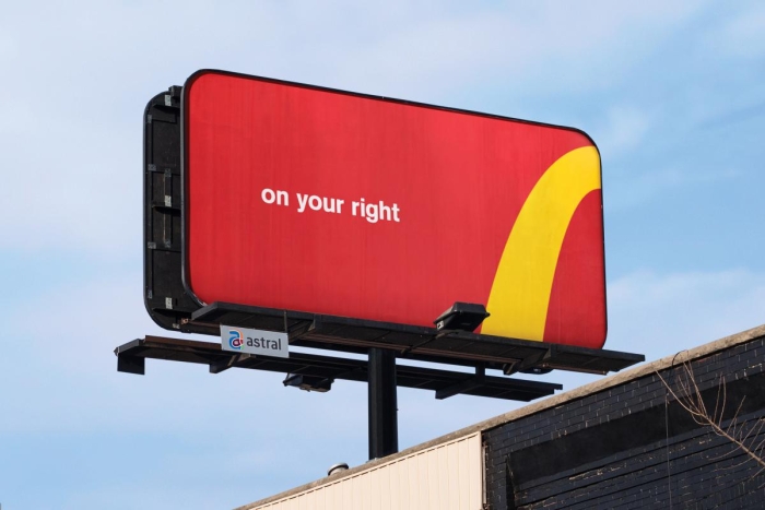 Image source: Cossette
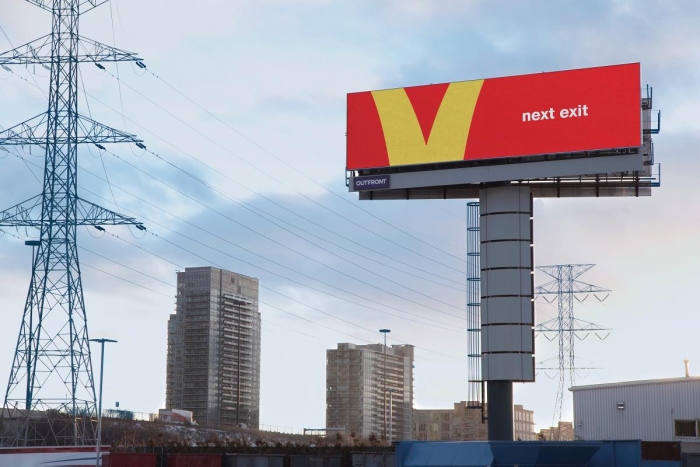 Image source: Cossette
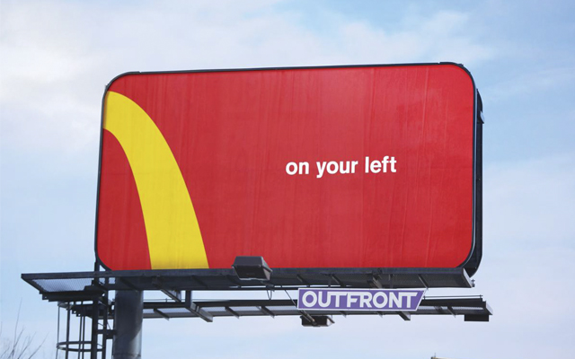
McDonald's Canada has launched its new ad campaign named ''Follow the Arches''
Image source: Cossette
In collaboration with agency Cassette, McDonald's has used one of the most recognizable logos in the world - its golden arches
Image source: Cossette
These deconstructed arches not only direct drivers to the nearest restaurant, it also shows that everybody knows this McDonald's logo
Image source: Cossette
This campaign surprises by its basic yet genius use of the simplest graphics elements
Image source: Cossette
In their representational video, Cossette explains their goal to create a consistent McDonald's ad that can be understood all around the world
DE
Written by
Demilked Editorial
SaaS Review Specialist · Demilked
With 5+ years in the creator, entertainment, and publishing spaces, Demilked shortlists, reviews, and ranks leading tools that actually make your life easier.