35 Cool Maps That May Shift Your Perspective Of The World
If you’re a more visual learner, this particular list will definitely tickle your fancy. Found on an armchair-cartography-lovers Facebook page, the “Simon shows you maps” community is rampant with posts that disseminate information in graphic form.
Mapping out insightful information for easier understanding, the following list covers various fascinating subjects from a scientific or data-driven perspective.
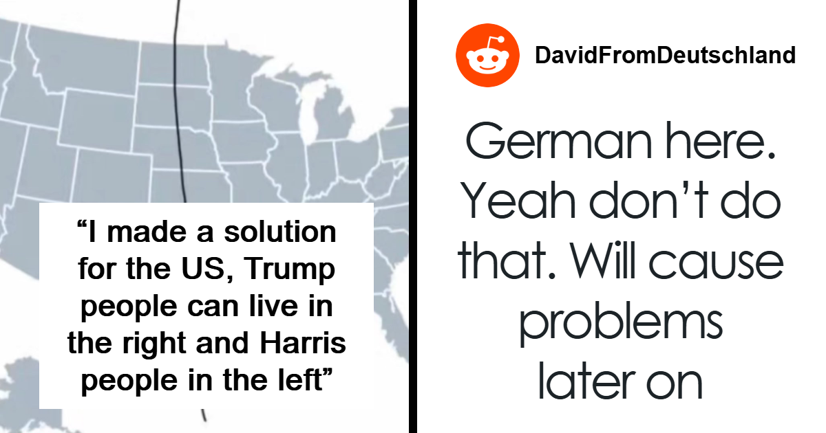
#1 Stumbled Across A Dumb Little Post
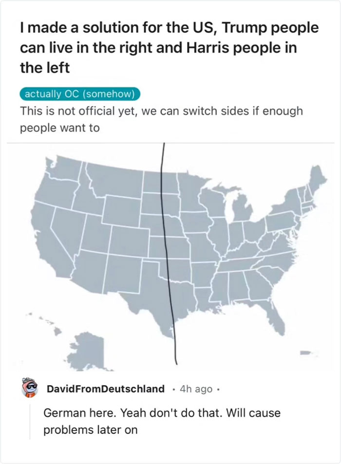
Image source: Simon shows you maps
#2 As A German, For A Personal Meeting 12 Means 12 But For A Professional Meeting 12 Means Be 5 Minutes Early. Any Alternative Interpretation Hurts My Little German Brain
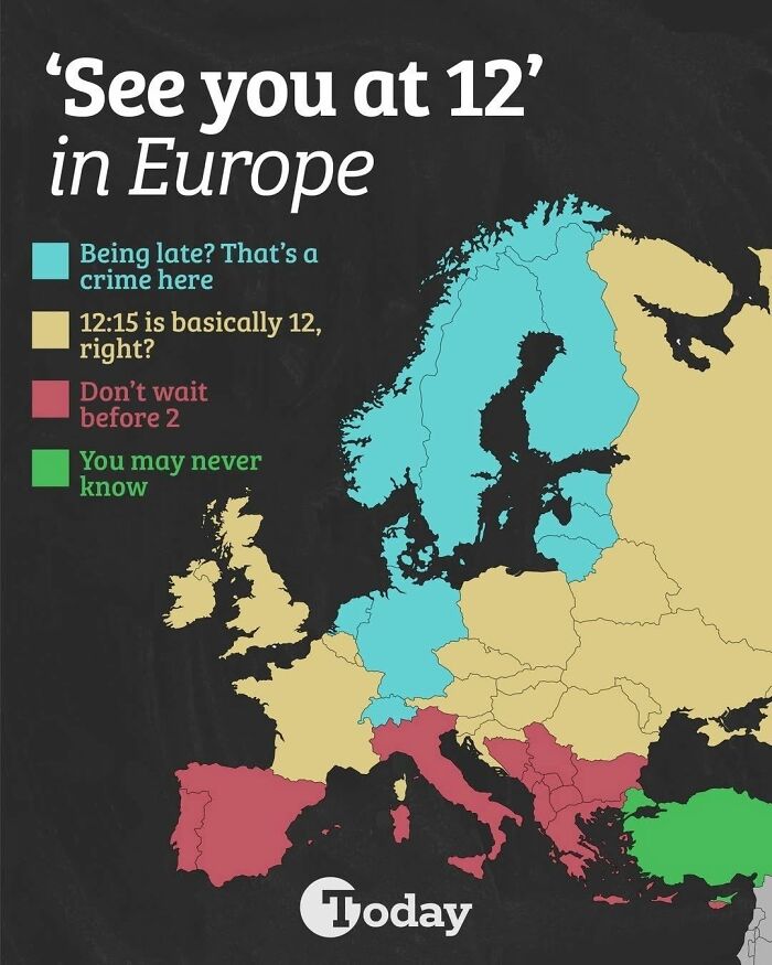
Image source: Simon shows you maps
#3 Let’s See If This Map Will Come In Handy Any Time Soon
Image source: Simon shows you maps
#4 For A While During The Northern Hemisphere’s Summer, The Sun Sets In Eastern Brazil Before It Does In Ireland. Now You Know
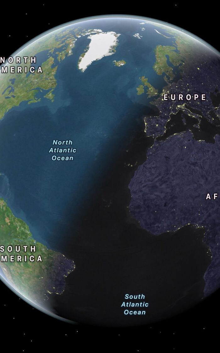
Image source: Simon shows you maps
#5 Etymology Of Spain. This Map Shows The Origin Of Various Spanish Province Names
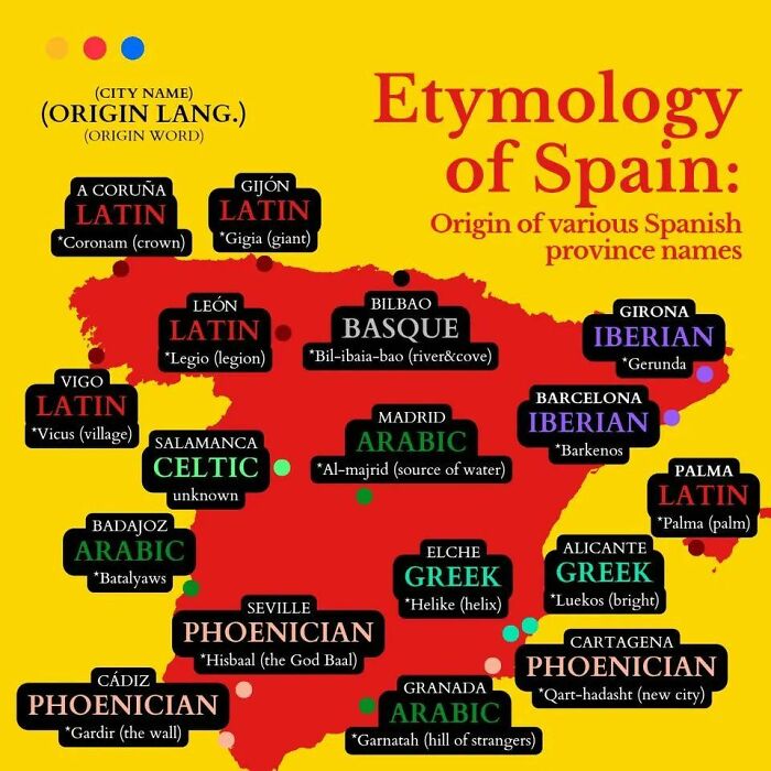
Image source: Simon shows you maps
#6 This Map Shows What The Word “Yankee” Means Around The World
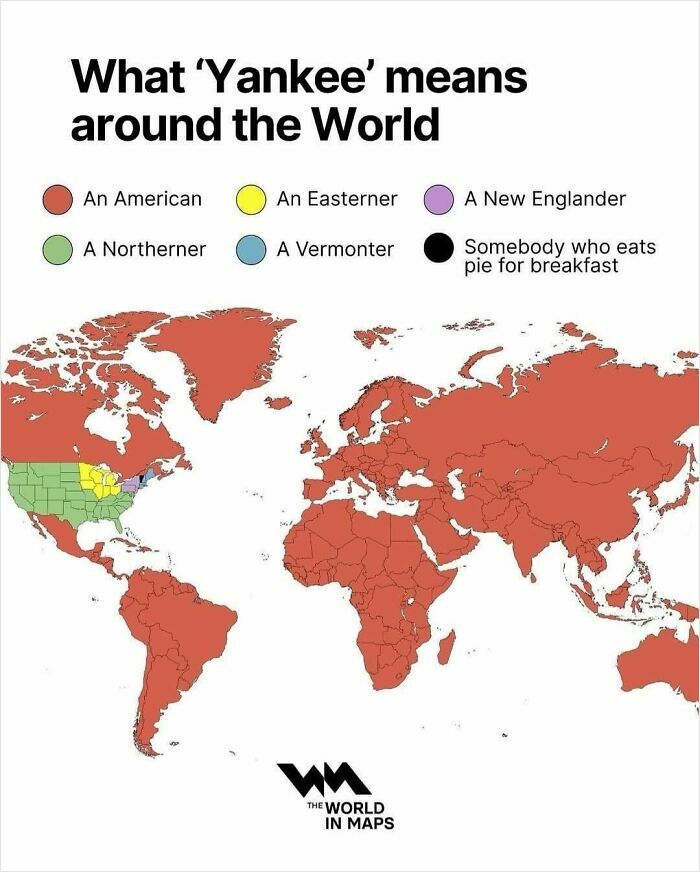
Image source: Simon shows you maps
#7 There Are European Cities That Have Been Continuously Inhabited For 7000-8000 Years!
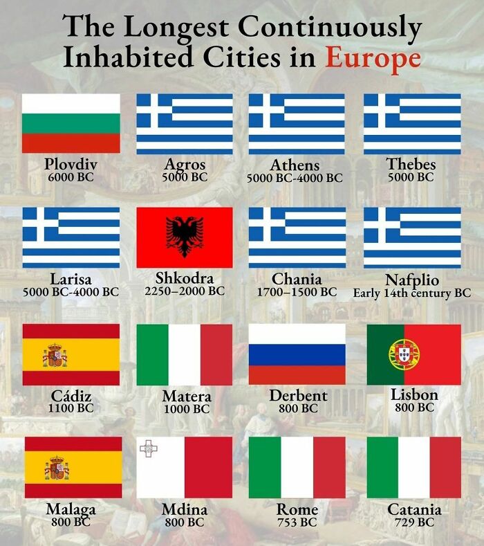
Image source: Simon shows you maps
#8
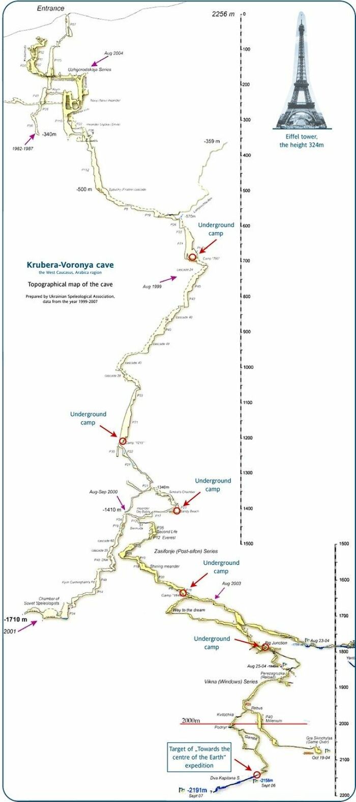
Image source: Simon shows you maps
Wait, this is a real thing? A cave deeper than 2000m? And people are crazy enough to go all the way down? Good lord! It’s a hard no from me. Happy to support mountaineers all the way to the top but caving is a big no no for your friendly armchair cartography enthusiast
#9 Map Shows The World In About 250 Million Years
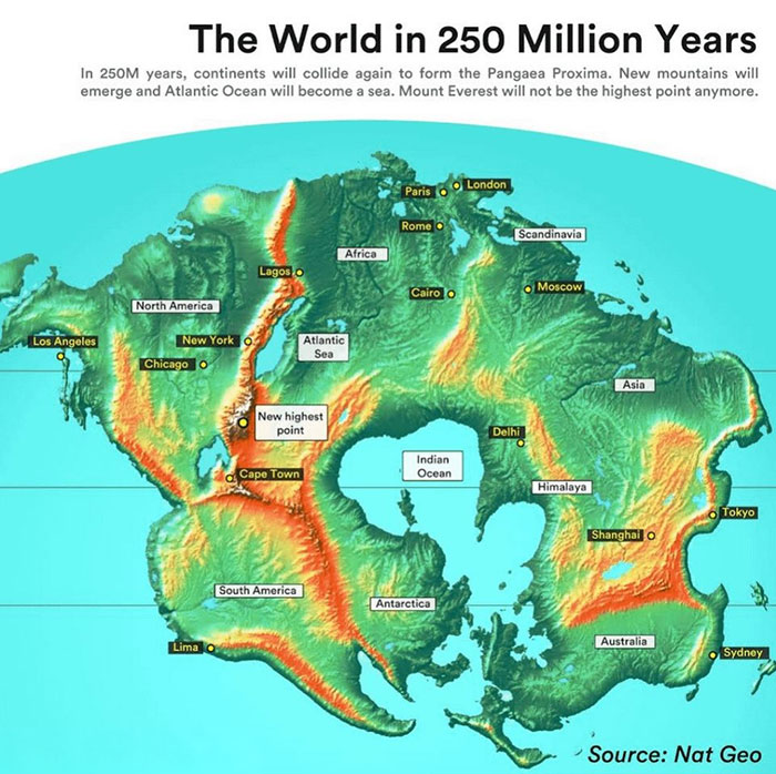
Image source: Simon shows you maps
#10
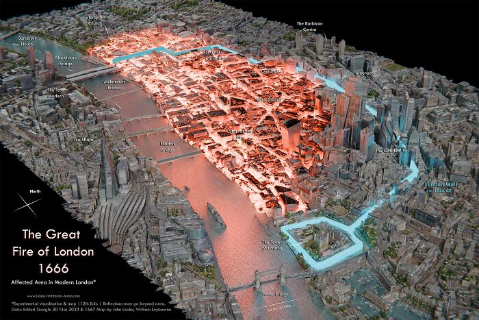
Image source: Simon shows you maps
The Great Fire of London ragged in 1666. This fantastic map overlays the effected area on modern day London. Would be cool to walk the area to feel the extent
#11
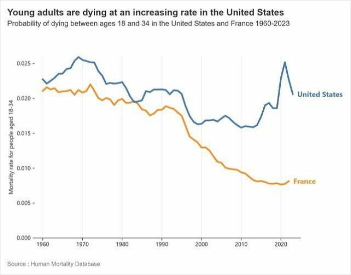
Image source: Simon shows you maps
Young adults are dying at an increasing rate in the United States. France roughly mirrored the US before the introduction of Oxycontin in the mid-90s and later fentanyl. The US isn’t doing a great job looking after its own people
#12 Germany’s Economy Faces Many Struggles Buuuuut It Is Still Huge As This Map Reminds Us
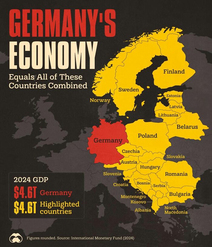
Image source: Simon shows you maps
#13
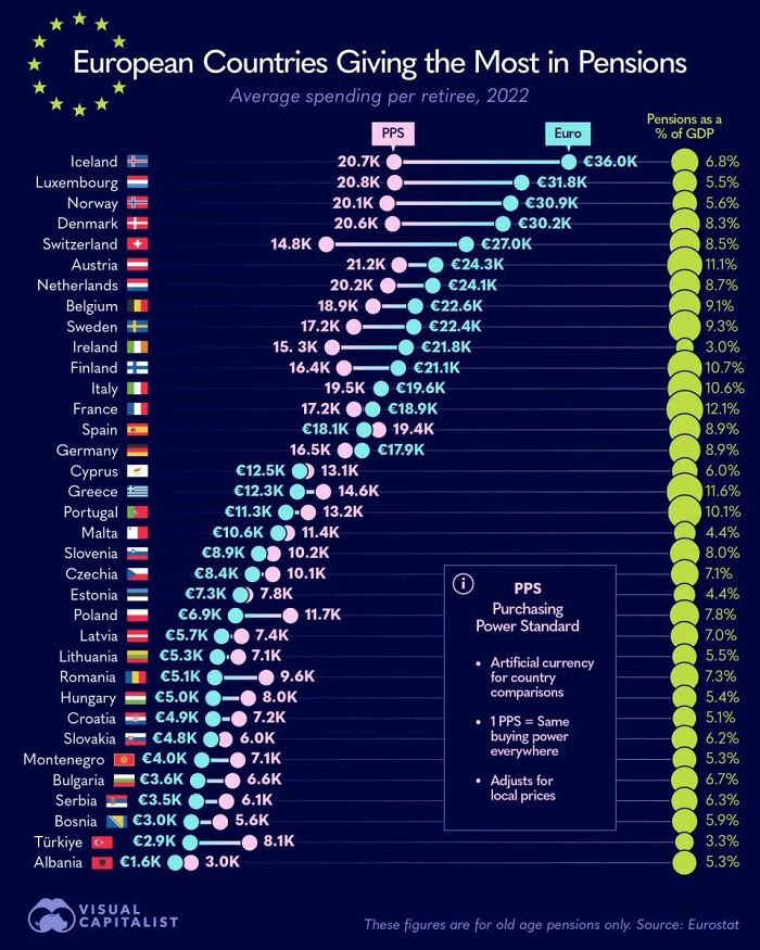
Image source: Simon shows you maps
In places like Germany, the full retirement of the huge Baby Boomer cohort will drive pension payments up significantly. The relatively small workforce will pay for that. Young workers will increasingly dislike that. Voting behaviour might shift further away from established parties as a result.
#14 Germans And Scandinavias Holidaying In Spain Lose Their Mind Over The Late Dinners
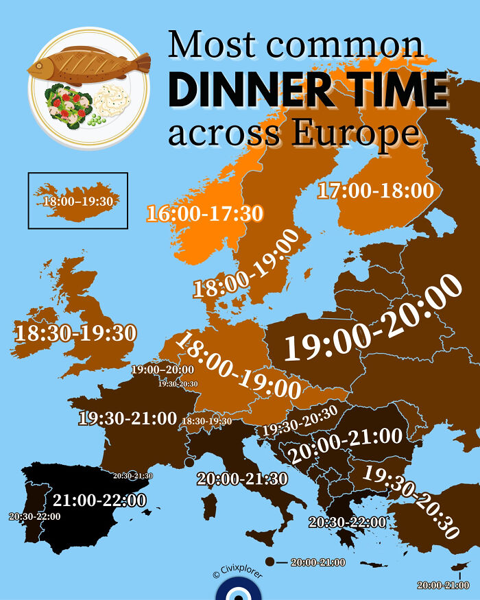
Image source: Simon shows you maps
#15 Time Traveling Back To 600 Ad Europe, Would You Be Able To Communicate With Anyone?
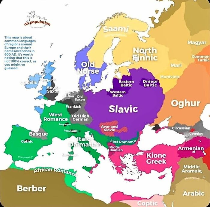
Image source: Simon shows you maps
#16 If You Are Being Born Today, This Is The Likelihood Of You Ending Up In Each Continent
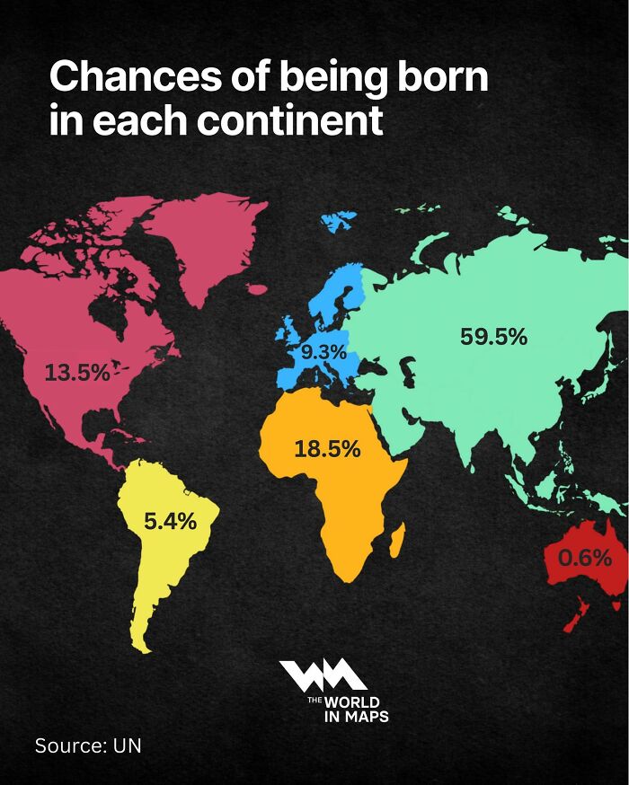
Image source: Simon shows you maps
#17 Challenge: Which Definition, Which Terminology Doesn’t Offend Anyone? I’ve Found That Someone Will Always Be Mad
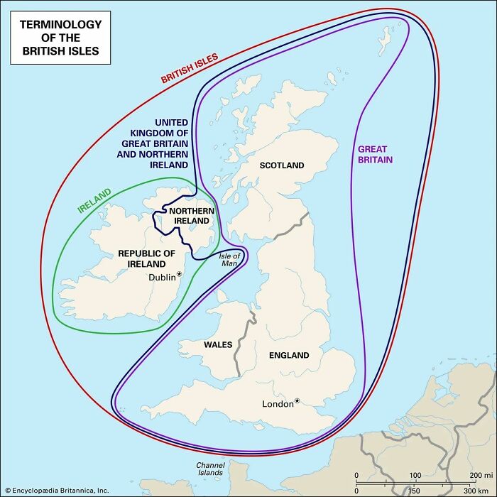
Image source: Simon shows you maps
#18 In A World Where More People Obsess About Their Work Being Inherently Meaningful, I Hope That You See Your Job Relatively Close To The Left Side Of The Chart
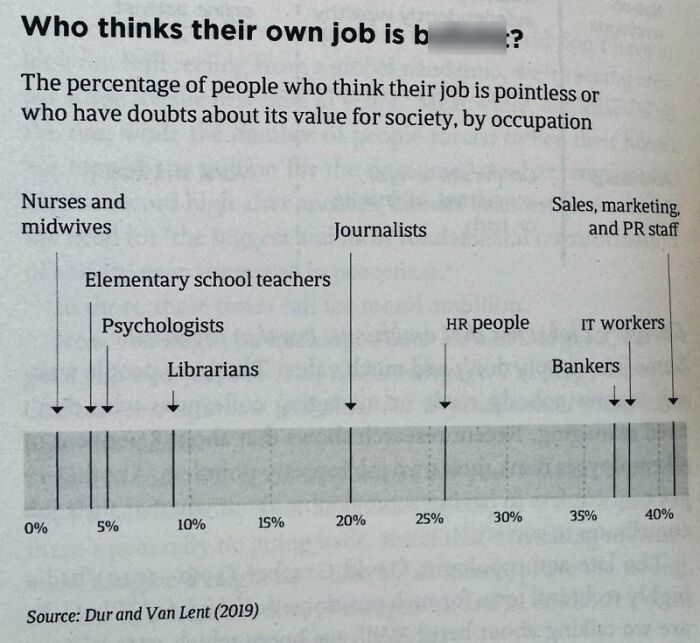
Image source: Simon shows you maps
#19 Truth
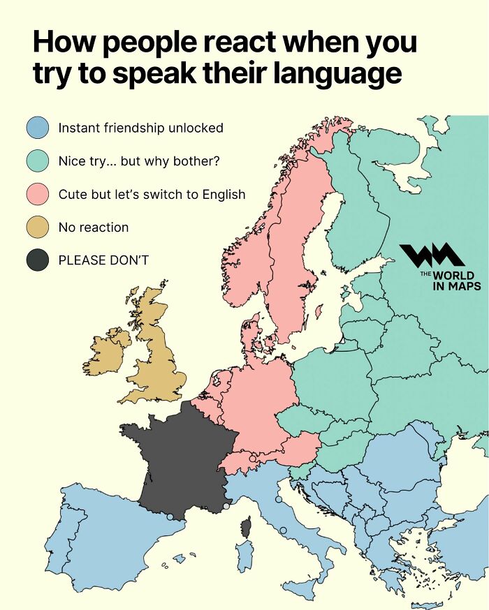
Image source: Simon shows you maps
#20
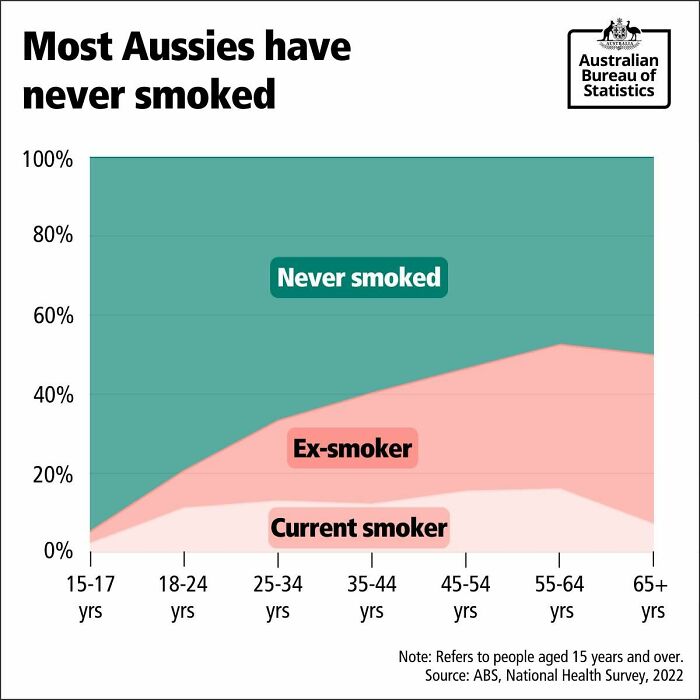
Image source: Simon shows you maps
The Australian efforts towards tackling the public health issue that is smoking were super successful. Something the country should be proud of. Look at the huge number of ex smokers Australian policies created. Good stuff.
#21 Fun Infographic Shows When We Tend To Peak At Certain Things
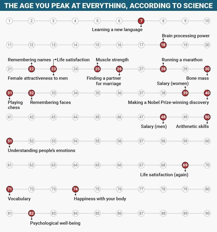
Image source: Simon shows you maps
#22 Technically Correct
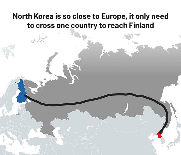
Image source: Simon shows you maps
#23 This Map Shows The Number Of Dentists Per 10,000 Residents Across Europe
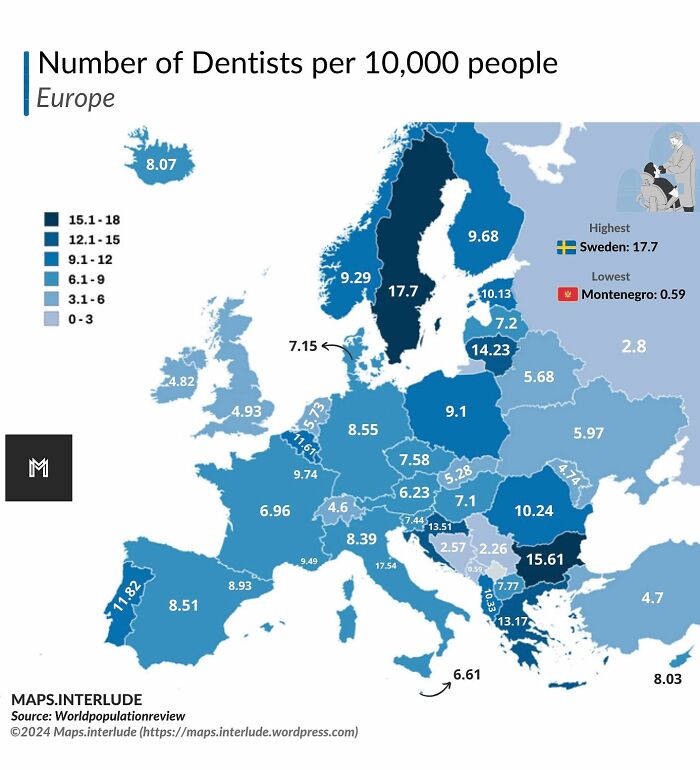
Image source: Simon shows you maps
#24
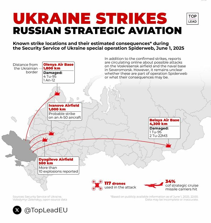
Image source: Simon shows you maps
This map of Ukrainian deep strike capability is astonishing. Drone warfare is so hard to defend against. Any country not heavily investing in defensive and offensive drone technology is simply naive.
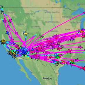
#25
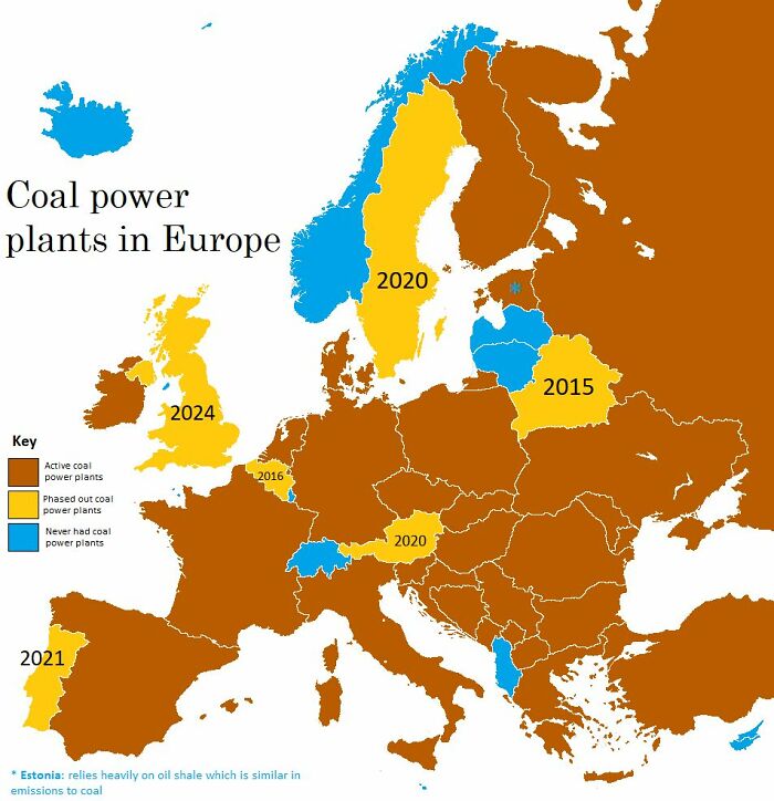
Image source: Simon shows you maps
This map shows the status of coal power in Europe as of 2024. Coal is being phased out. Now it’s time to drive down energy costs. Crucial considering the continent wants to be competitive in high end manufacturing, needs big data centers, and wants at least a bit of supply chain sovereignty.
#26
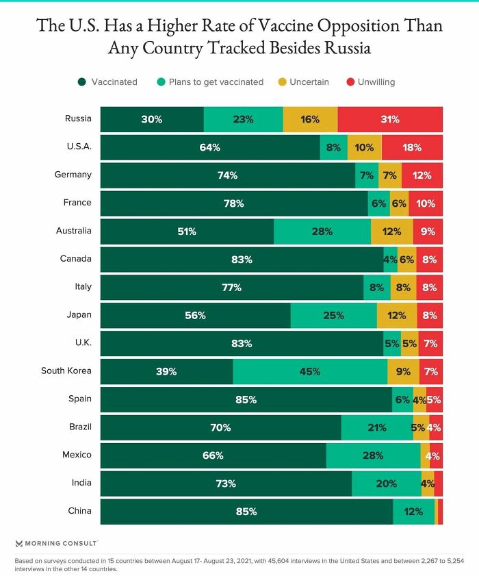
Image source: Simon shows you maps
Almost one third of Russians are opposed to vaccines. The second ranked country is the world’s most advanced economy happily shooting itself not in the arm but in the foot. My birth country of Germany also has unnecessarily high opposition
#27 I Live Such A Sheltered Life That I Had Never Heard Of A Horse Chopping Sabre Before
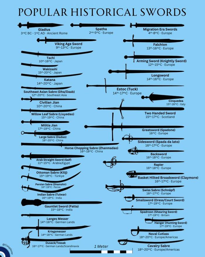
Image source: Simon shows you maps
#28 Look Who Just Made It Into The Top 20 Of The World’s Largest Economies. Welcome To The Top, Poland
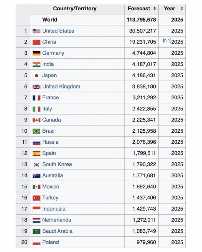
Image source: Simon shows you maps
#29 Just A Quick Reminder. A Little Public Service Announcement To Please My Dutch Friends
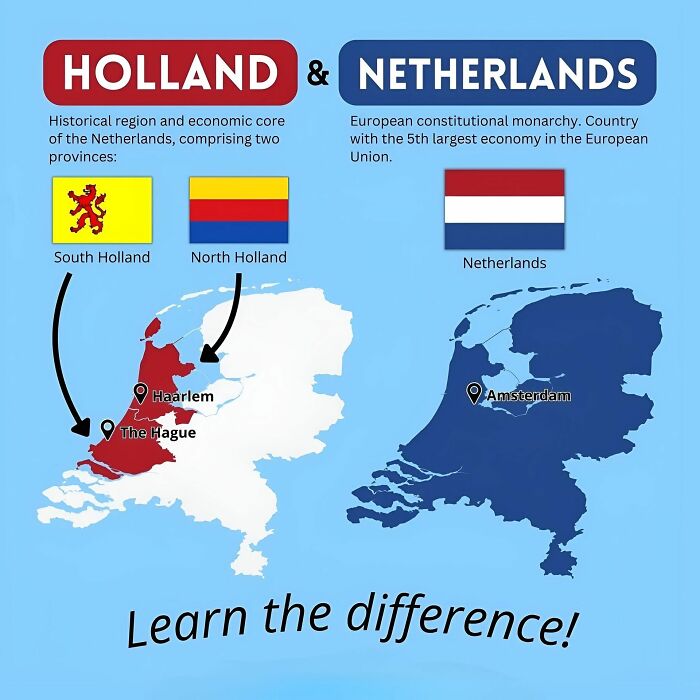
Image source: Simon shows you maps
#30 This Map Shows The Number Of Ant Species In The 50 Most “Antsy” Countries
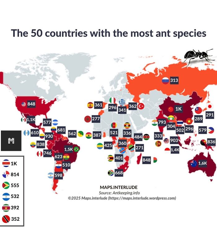
Image source: Simon shows you maps
#31 Roosters Without Borders
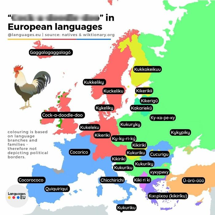
Image source: Simon shows you maps
#32
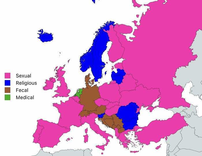
Image source: Simon shows you maps
The classification of Germany in this map classifying the nature of most commonly used profanities across Europe is certainly correct. I would argue a whole category is missing here: family related profanities. Sure, they are often mixed with sexual insults but I thing they deserve their own category!
#33
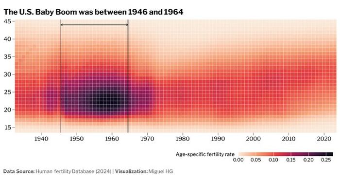
Image source: Simon shows you maps
I had never seen the US Baby Boom been visualized in this way. Rather cool visuals. The chart assumes Baby Boomers to be born between 1946 and 1964
#34 By 2050 India Will Be One United States Bigger Than China
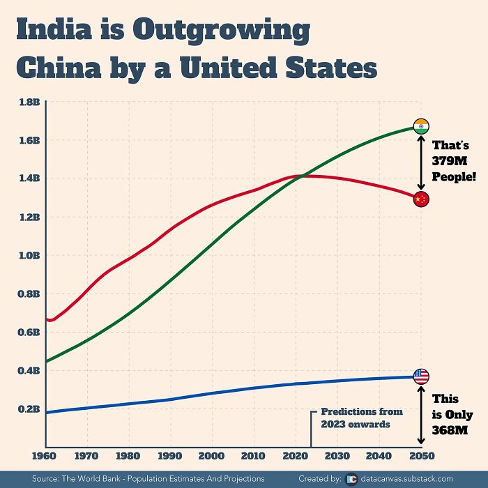
Image source: Simon shows you maps
#35 Want To Swear But Kids Are Around? Use These Kid-Friendly Swear Words!
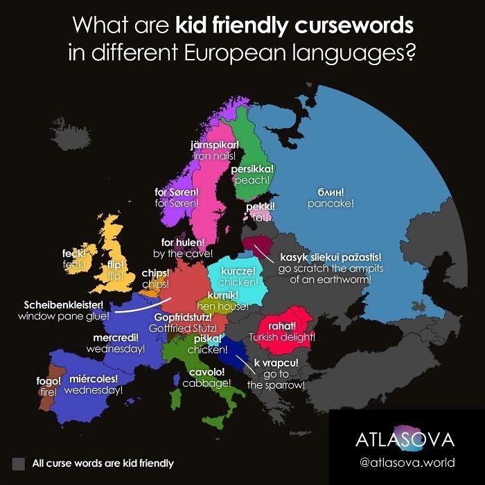
Image source: Simon shows you maps


Got wisdom to pour?
These maps are truly fascinating, they completely change how we see the world! I had no idea some European cities have been continuously inhabited for over 7,000 years, or that there’s a cave deeper than 2,000 meters. Makes me want to learn even more. Thanks for sharing this visual feast, perfect for geography buffs and curious minds alike! https://agence-habitat.org/