
15 Maps Reveal How The World Actually Looks
I bet you’re fairly familiar with the world map, but did you know that the most popular version of it, that we study and use, is actually not a very accurate representation of an actual globe?
Some countries look way bigger than others, and that’s not always due to them actually taking more space on the globe. It’s because of something called the Mercator Projection. Popular Youtube science channel Vsauce did a detailed video explaining this, which in short says: the popular map format we’ve adopted almost everywhere, is good at mimicking the shape of land masses, but is pretty loose when it comes to an actual scale.
The problem comes when you try to put a 3D planet on a two-dimensional map. Geographer and cartographer Gerardus Mercator came up with a solution back in 1569. He designed a map that could be accurately used for navigation purposes, but the downside was that his system distorted the size of objects depending on their position relative to the equator.
The guys at Bored Panda went to thetruesize.com to play with this concept and here we bring you the pics of what they uncovered.
More info: thetruesize.com (h/t: boredpanda)
#1 US Moved Down Next To Australia Looks Unbelievably Small

#2 Russia On The Equator Is Not A Giant Bear Anymore

#3 Australia Is Way Bigger Than You May Think – It Covers Almost The Whole Of Europe

#4 If Romania Was An Island In The Arctic Ocean

#5 If Brazil Was In Asia It Would Be Massive

#6 Greenland Is Not So Big When Compared To USA And Brazil

#7 Indonesia Would Spread Almost Across The Whole Of Russia

#8 When You Move Canada To South America

#9 California Moved Onto The UK Shows They’re Quite Similar In Size

#10 China Placed On Top Of Russia

#11 Australia Moved Onto North America Becomes REALLY Big

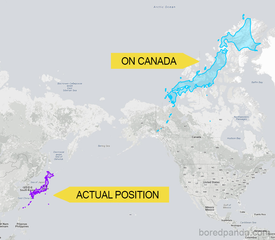
#12 Japan Can Stretch Almost Across Canada
#13 Antarctica Is Not So Much Larger Than Brazil

#14 This Is How India Changes As You Move It North

#15 If Poland Was An Island In The Norwegian Sea

Your country wasn’t in the pics? Head over to thetruesize.com and fix that.


Got wisdom to pour?