
20 Times Boring Statistics And Numbers Were Turned Into Art
Who said data can't be beautiful?
Independently testedUnbiased Demilked scoreFree to implementTools included
What if we told you that not all data needs to be boring? What if we told you that interesting stats and eye-catching infographics exist?
If you don't believe us, then the subreddit Data is Beautiful will clarify all your doubts. From the list of highest-paid actors to the surge in egg prices in the US, you'll get to know a lot of unexpected and fascinating things through their aesthetically pleasing charts. Scroll below and enjoy. And if you want to see more, check out our previous post here. More info: Reddit#1 Highest Paid Actors For A Single Production
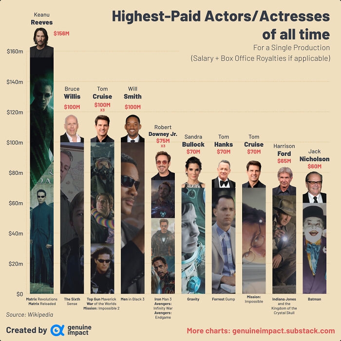 Image source: giteam
#2 Covid-19 Accounted For More Line-Of-Duty Police Deaths Last Year Than All Other Causes Combined
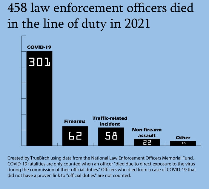 Image source: TrueBirch
#3 Actors/Actresses With The Most Oscar Wins
 Image source: giteam
#4 USA: Who Do We Spend Time With Across Our Lifetimes?
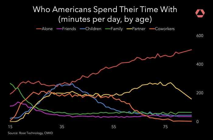 Image source: rosetechnology
#5 Bloom Dates For Every Flower In My Garden- Everyone In R/Gardening Wanted Me To Share This Here, Hope You’ll Allow It!
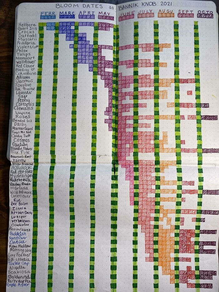 Image source: M-Rage
#6 Countries With School Shootings (Total Incidents From Jan 2009 To May 2018)
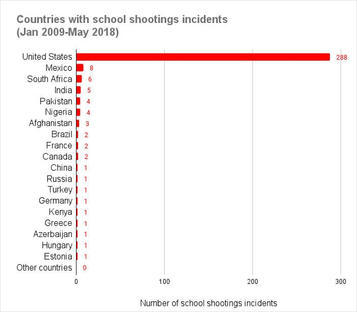 Image source: flyingcatwithhorns
#7 Gordon Ramsay And Martha Stewart Are Being Outperformed By Doña Angela, A Grandma From Rural Mexico And Her Daughter's Phone Camera
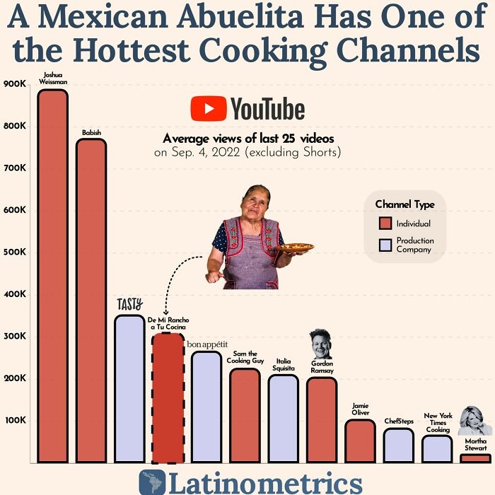 Image source: latinometrics
#8 I Recorded The Race Of All 433 Actors In The 2022 Super Bowl Commercials. Here's How They Compare To The Actual Us Population
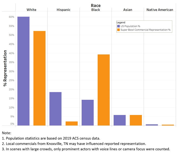 Image source: TheBigBo-Peep
#9 Richest Billionaire In Each State
 Image source: Dremarious
#10 Surge In Egg Prices In The U.s
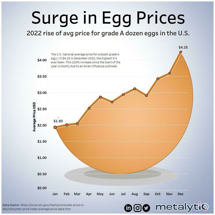 Image source: Metalytiq
#11 The Most Watched Netflix Shows
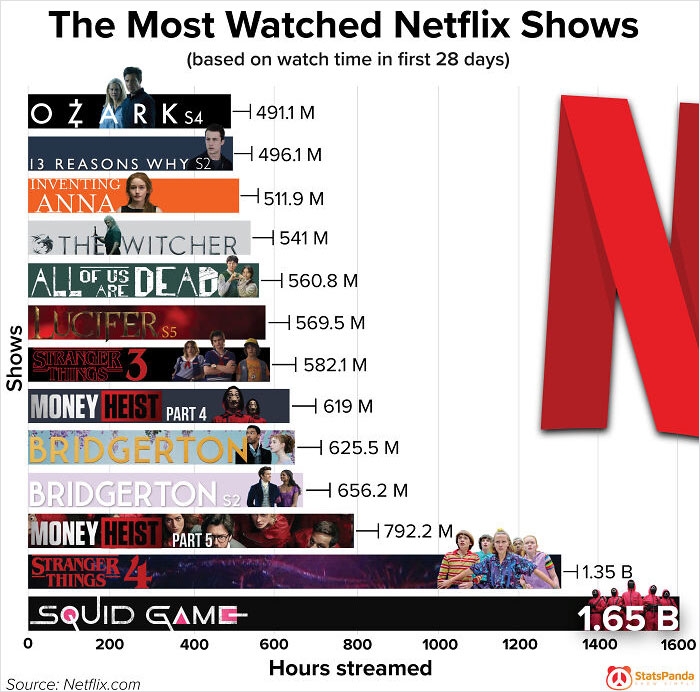 Image source: Dremarious
#12 World Population 2023 In A Single Chart Calculate In Millions Of People. China, India, The Us, And The Eu Combined Generate Half Of The World’s Gdp And Are Home To Almost Half Of The World’s Population
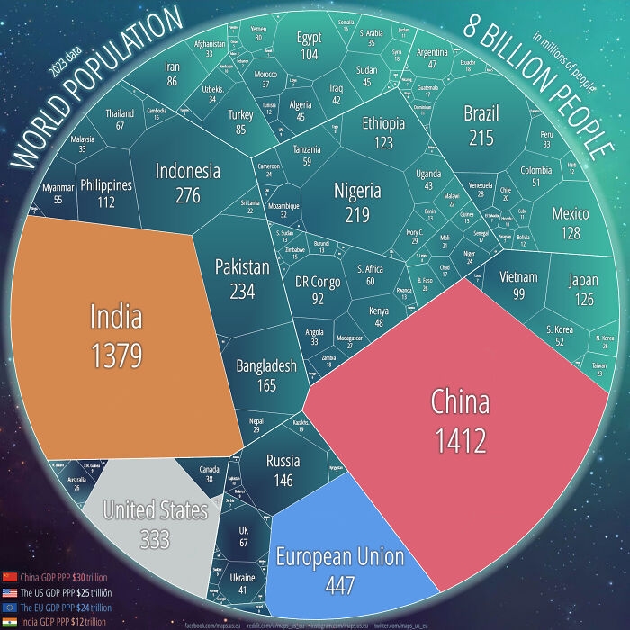 Image source: maps_us_eu
#13 Abortion Deaths In The USA (1968-2018)
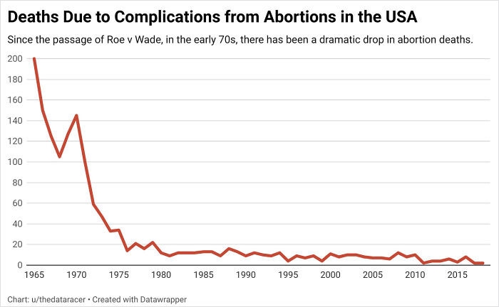 Image source: thedataracer
#14 [oc] I Updated Our Famous Password Table For 2022
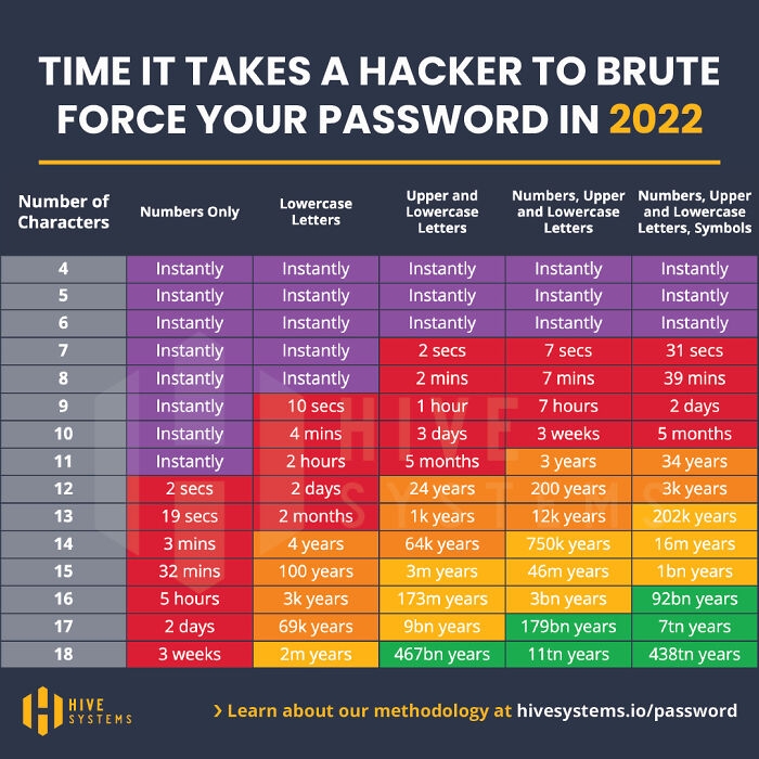 Image source: hivesystems
#15 USA Cigarettes Sold V. Lung Cancer Death Rates
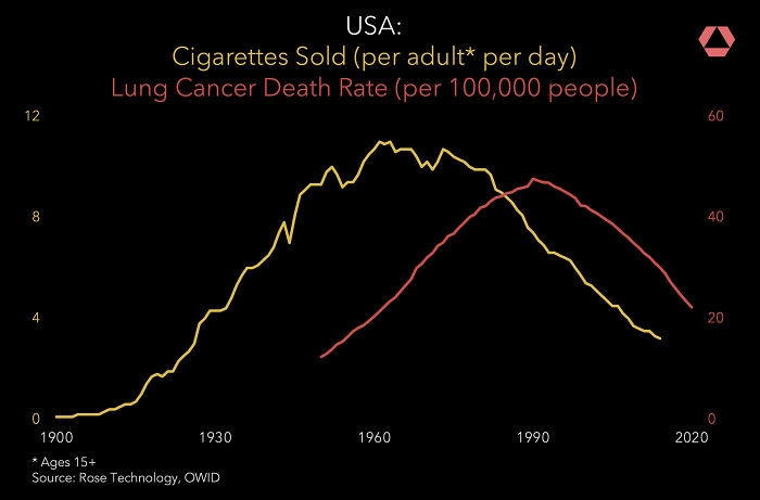 Image source: rosetechnology
#16 Young Adults Are Leading The Mass Exodus From Christianity In The Us
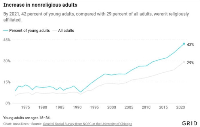 Image source: gridnews
#17 Japan's Work To Reduce Homelessness
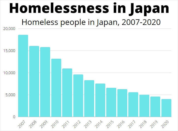 Image source: Xsythe
#18 The Popularity Of The Name "Mabel" In The United States Skyrocketed After Gravity Falls Came Out
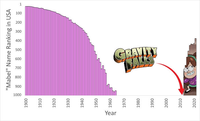 Image source: Aloiciousss
#19 Costco Hot Dog Combo vs. Inflation
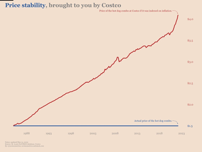 Image source: nick_ecoinometrics
#20 Frequency Of Compound Insults (E.g. "Poophead", "Scumwad") In Reddit Comments, Organized By Prefix And Suffix
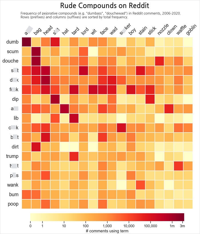 Image source: halfeatenscone
DE
Written by
Demilked Editorial
SaaS Review Specialist · Demilked
With 5+ years in the creator, entertainment, and publishing spaces, Demilked shortlists, reviews, and ranks leading tools that actually make your life easier.