20 Colorful And Interesting Data Visualizations As Shared On The Online Group "Data Is Beautiful"
A subreddit "Data is beautiful" is dedicated to visualizations that effectively convey information. The creative and colorful charts and graphs make boring data interesting to read.
Do you like reading those boring black-and-white statistics that look so dull and complicated? The subreddit r/DataIsBeautiful has revealed that there is a way to make numbers and stats appear more interesting and make data easier to understand. This subreddit is a place where 16 million members have taken up the responsibility of creating aesthetically pleasing data. Yes, you read it right! This community's only goal is to collect visualizations that effectively convey information.
This subreddit keeps delivering quality content all the time and we have collected a few of those interesting charts here. Keep scrolling to know some interesting info through these delightful pictures.
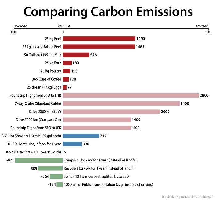 Image source: lfg10101
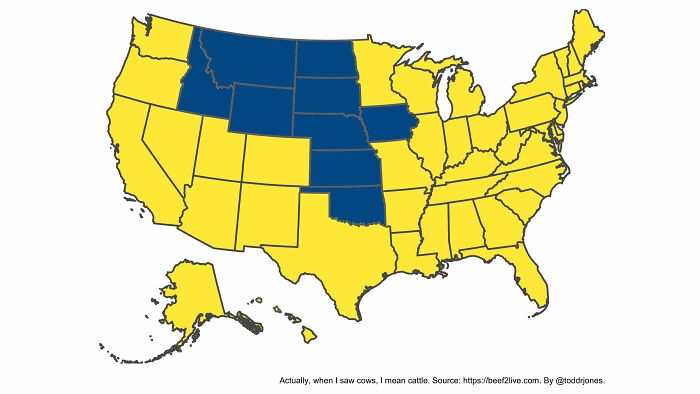 Image source: toddrjones
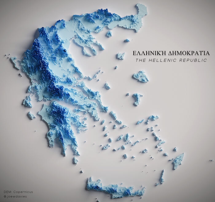 Image source: JoeWDavies
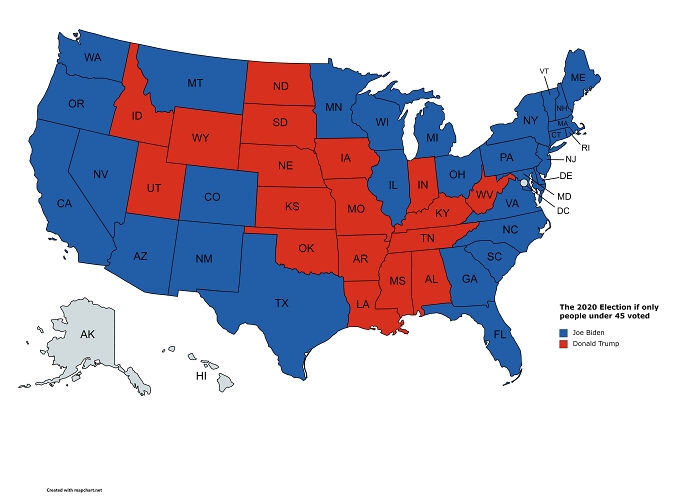 Image source: BLAZENIOSZ
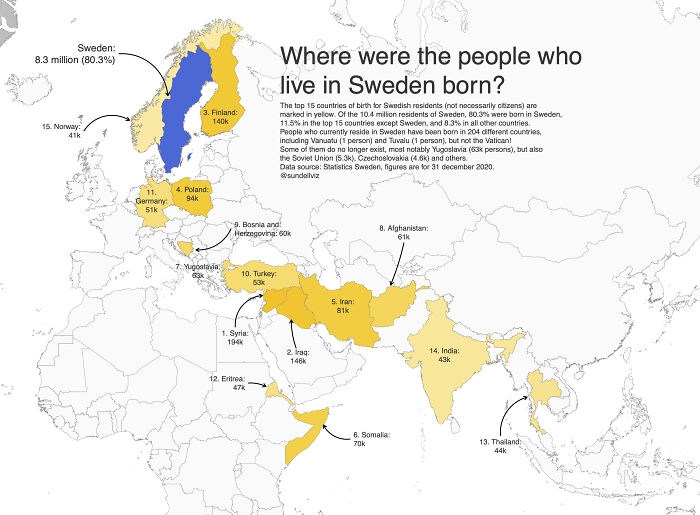 Image source: desfirsit
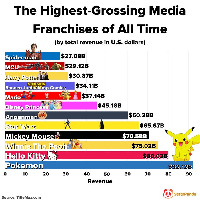 Image source: Dremarious
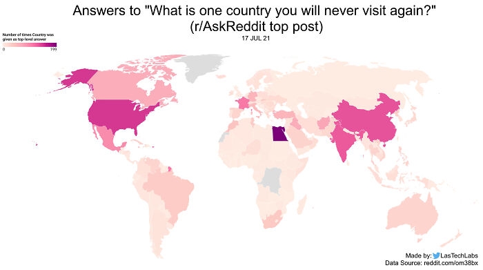 Image source: stkfig
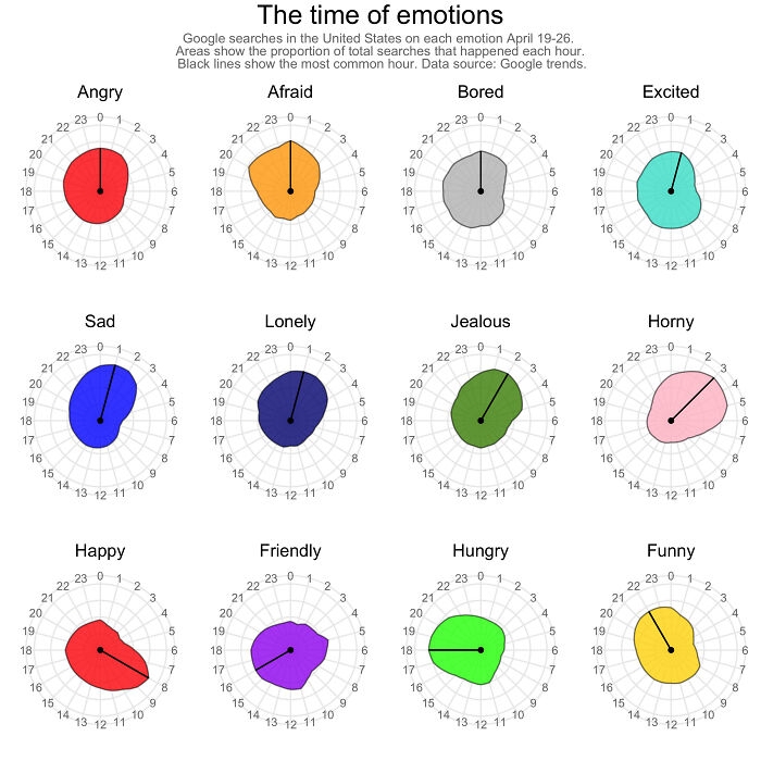 Image source: desfirsit
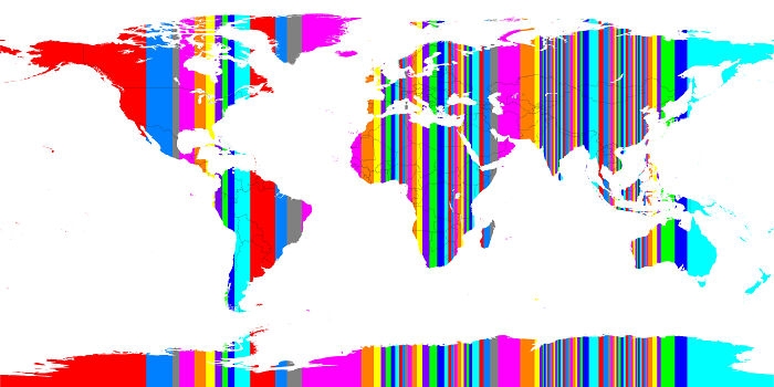 Image source: alexmijowastaken
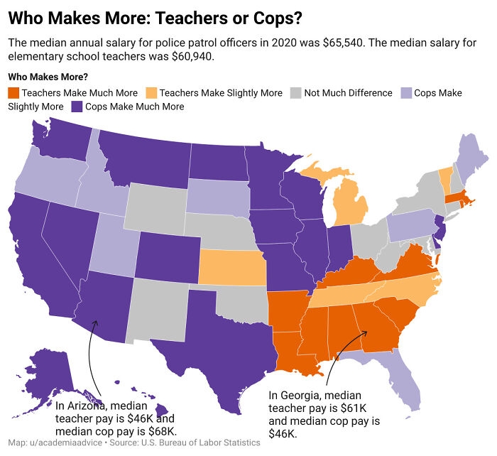 Image source: academiaadvice
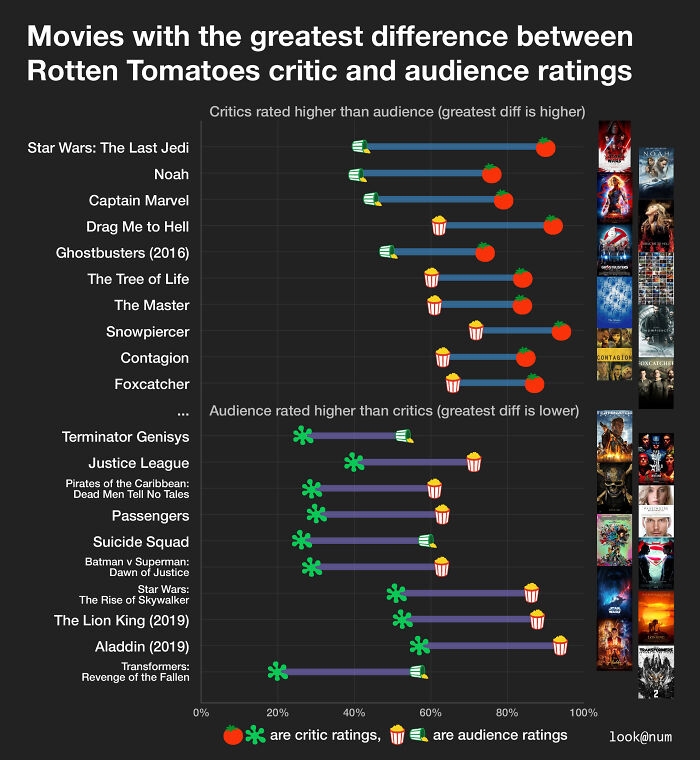 Image source: lookatnum
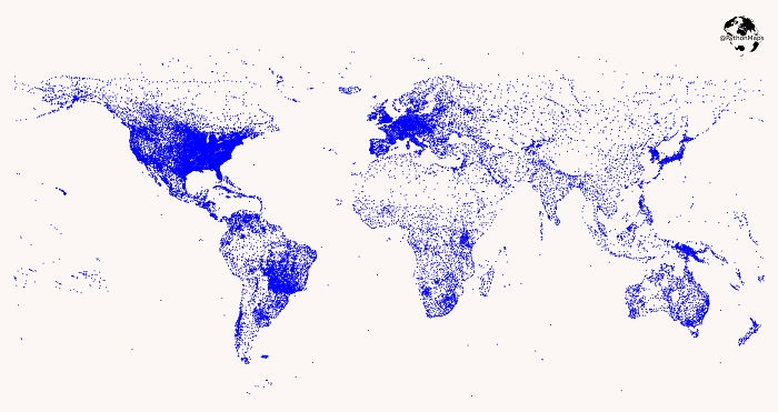 Image source: symmy546
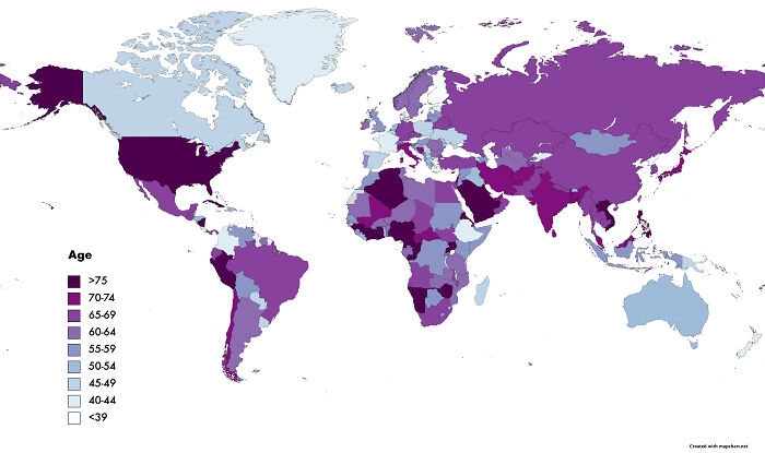 Image source: jkim088
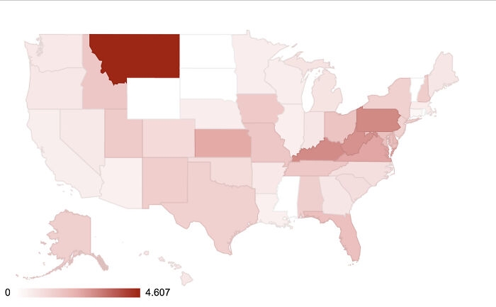 Image source: reddit.com
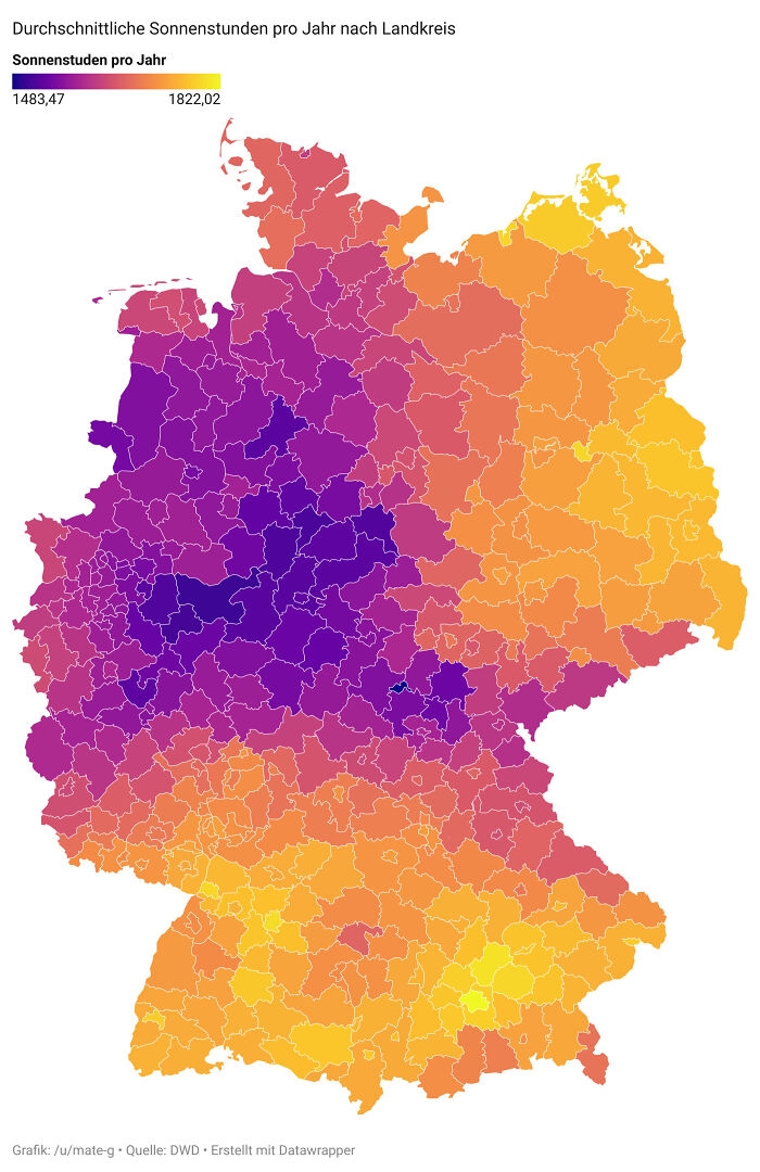 Image source: mate-g
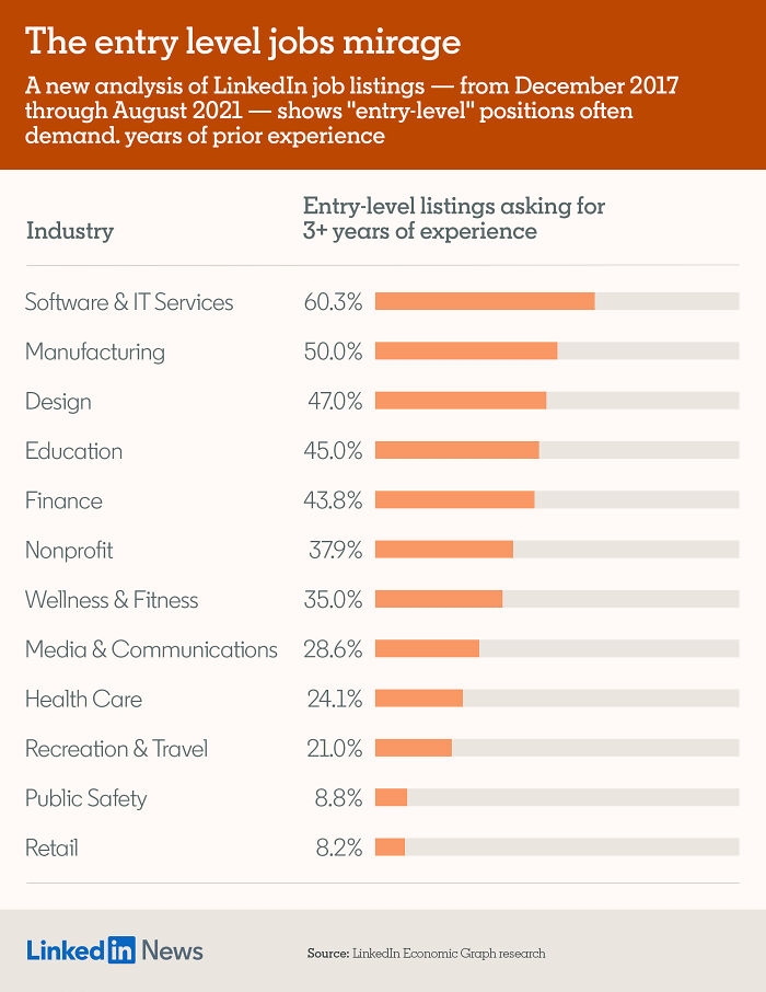 Image source: brixu
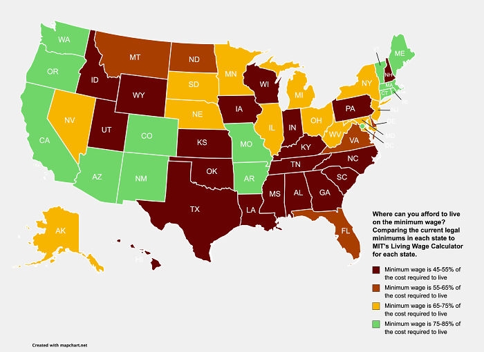 Image source: loveandwars
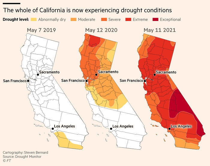 Image source: sdbernard
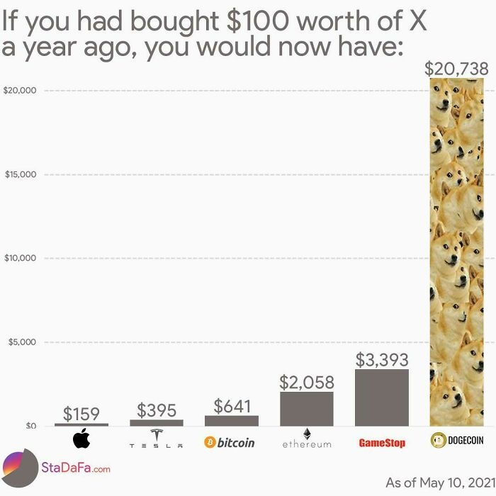 Image source: theimpossiblesalad
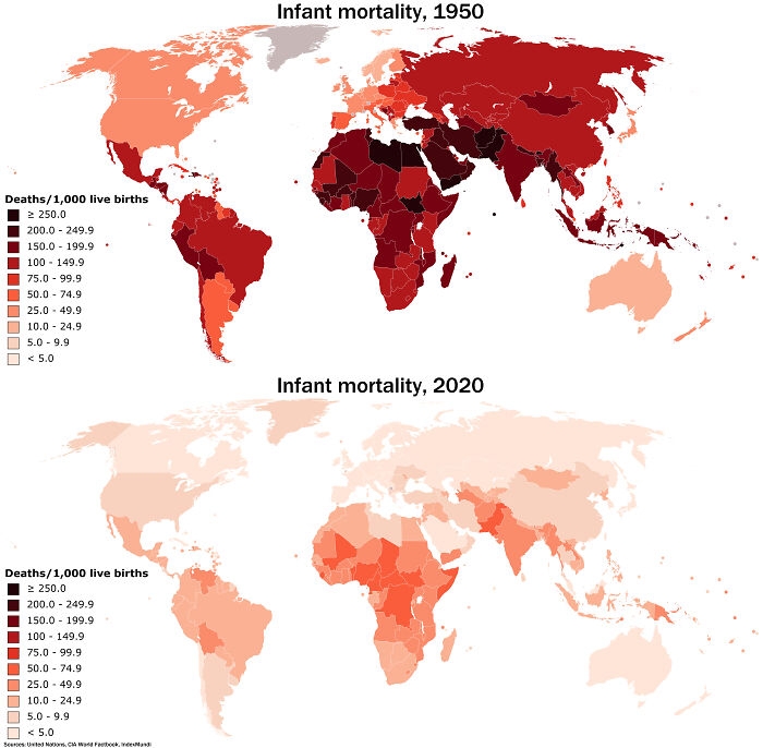 Image source: abu_doubleu
#1 Comparing Emissions Sources - How To Shrink Your Carbon Footprint More Effectively
Image source: lfg10101
#2 There Are More Cows Than People In The States Colored Blue
Image source: toddrjones
#3 Digital Elevation Model Of Greece
Image source: JoeWDavies
#4 The 2020 Election If Only People Under 45 Voted
Image source: BLAZENIOSZ
#5 The Top 15 Countries (Apart From Sweden) In Which The People Who Currently Live In Sweden Were Born
Image source: desfirsit
#6 The Highest-Grossing Media Franchises Of All Time
Image source: Dremarious
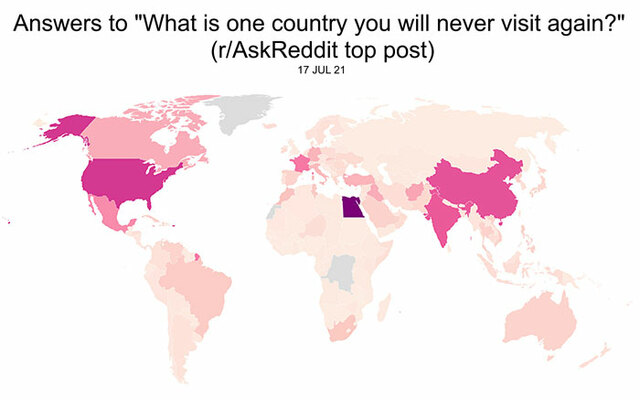
#7 "What Is One Country That You Will Never Visit Again?" Answers From R/Askreddit
Image source: stkfig
#8 Google Searches For Different Emotions During Each Hour Of The Day And Night
Image source: desfirsit
#9 Each Vertical Band Contains 1% Of The Earth's Population
Image source: alexmijowastaken
#10 Who Makes More: Teachers Or Cops?
Image source: academiaadvice
#11 Movies With The Greatest Difference Between Rotten Tomatoes Critic And Audience Ratings
Image source: lookatnum
#12 Where Are The World's Airports? This Map Shows Locations Of The Worlds Airports And Heliports
Image source: symmy546
#13 World Leaders By Age
Image source: jkim088
#14 Capitol Insurrection Arrests Per Million People By State
Image source: reddit.com
#15 Average Yearly Sunshine Hours Of Germany
Image source: mate-g
#16 35% Of "Entry-Level" Jobs On Linkedin Require 3+ Years Of Experience
Image source: brixu
#17 Where Can You Afford To Live On The Minimum Wage In The United States?
Image source: loveandwars
#18 Maps Showing Water Shortages During May Have Become Increasingly Extreme In California
Image source: sdbernard
#19 What If You Bought $100 Worth Of X A Year Ago?
Image source: theimpossiblesalad
#20 The Massive Decrease In Worldwide Infant Mortality From 1950 To 2020 Is Perhaps One Of Humanity's Greatest Achievements
Image source: abu_doubleuDE
Written by
Demilked Editorial
SaaS Review Specialist · Demilked
With 5+ years in the creator, entertainment, and publishing spaces, Demilked shortlists, reviews, and ranks leading tools that actually make your life easier.