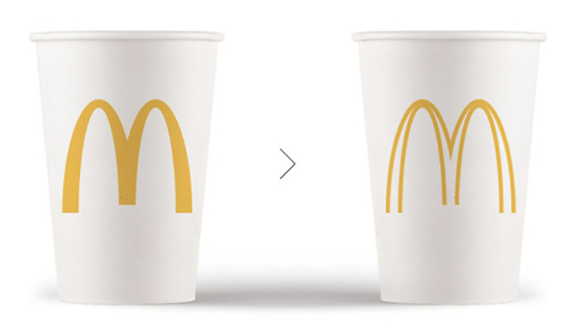
Popular Brand Logos Made More Eco-Friendly Using Less Ink
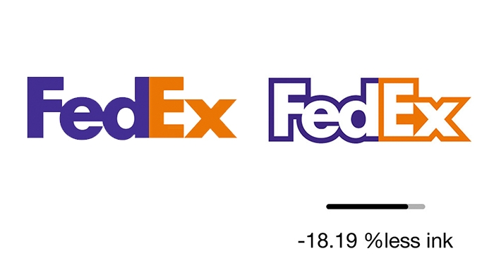
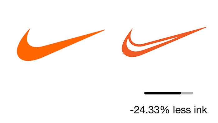
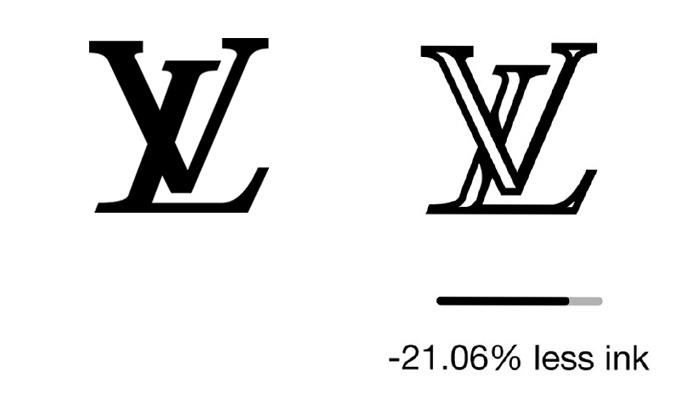
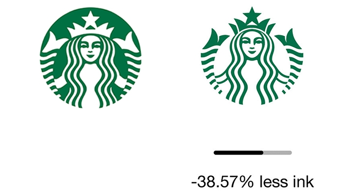
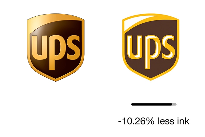
The ideas of conservation have been penetrating almost every aspect of our lives for a while now. And recently there was an introduction of another one called Ecobranding, which suggest big brands, who put their logos on millions of products every year, to make small adjustments in their logos and save dramatically on paint.
The ideas of conservation have been penetrating almost every aspect of our lives for a while now. And recently there was an introduction of another one called Ecobranding, which suggest big brands, who put their logos on millions of products every year, to make small adjustments in their logos and save dramatically on paint.
Recommended
Creating content or building your name online?
The wrong tools cost you time and money. The right ones help you grow to 1M+ views.
Audit my tools for freeWant to earn from your content?
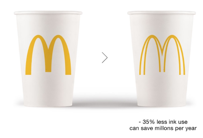
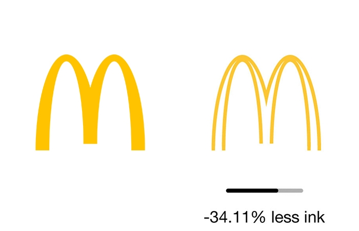
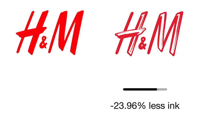
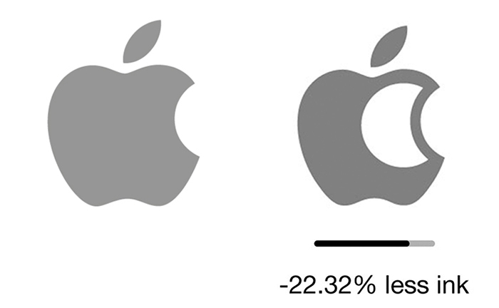
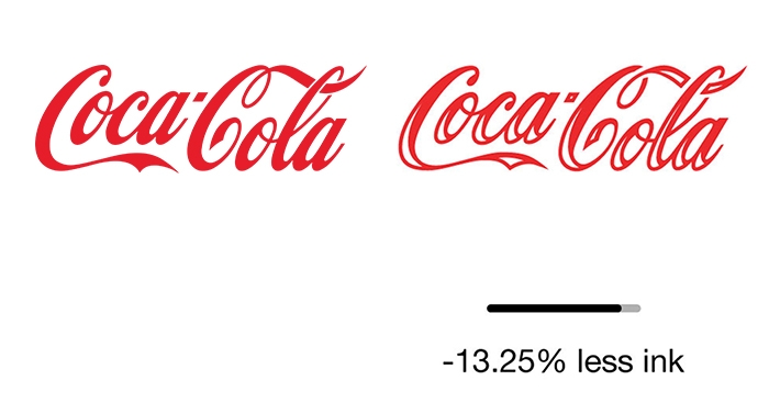
Tools to actually make money onlineThis conceptual experiment shows that changing the logos just slightly, you can reduce the amount of paint needed by 20% or in some cases even more. And when you multiply this by every product, printed ad, billboard and so on, you're looking at a meaningful number. And that's not even mentioning that some of those logos look even better with less dye in them.
Which ones do you prefer? Originals or these?
More info: ecobranding (h/t: designtaxi, boredpanda)
Did you know that printer ink costs twice as much as Chanel N°5?
Ecobranding aims to reduce that cost by using less ink in logos
This will also reduce the environmental impact of printing millions of logos
McDonalds
H&M
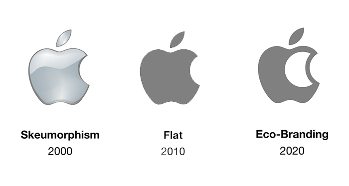
Apple
Coca Cola
Fedex
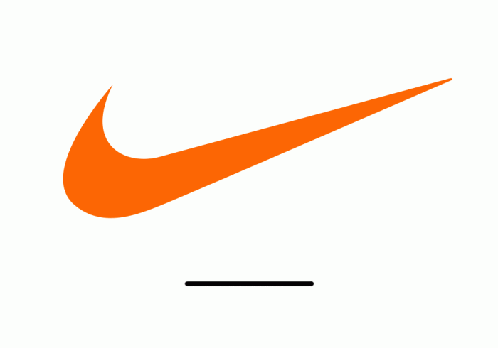
Nike
Luis Vuiton
Starbucks
Ups